
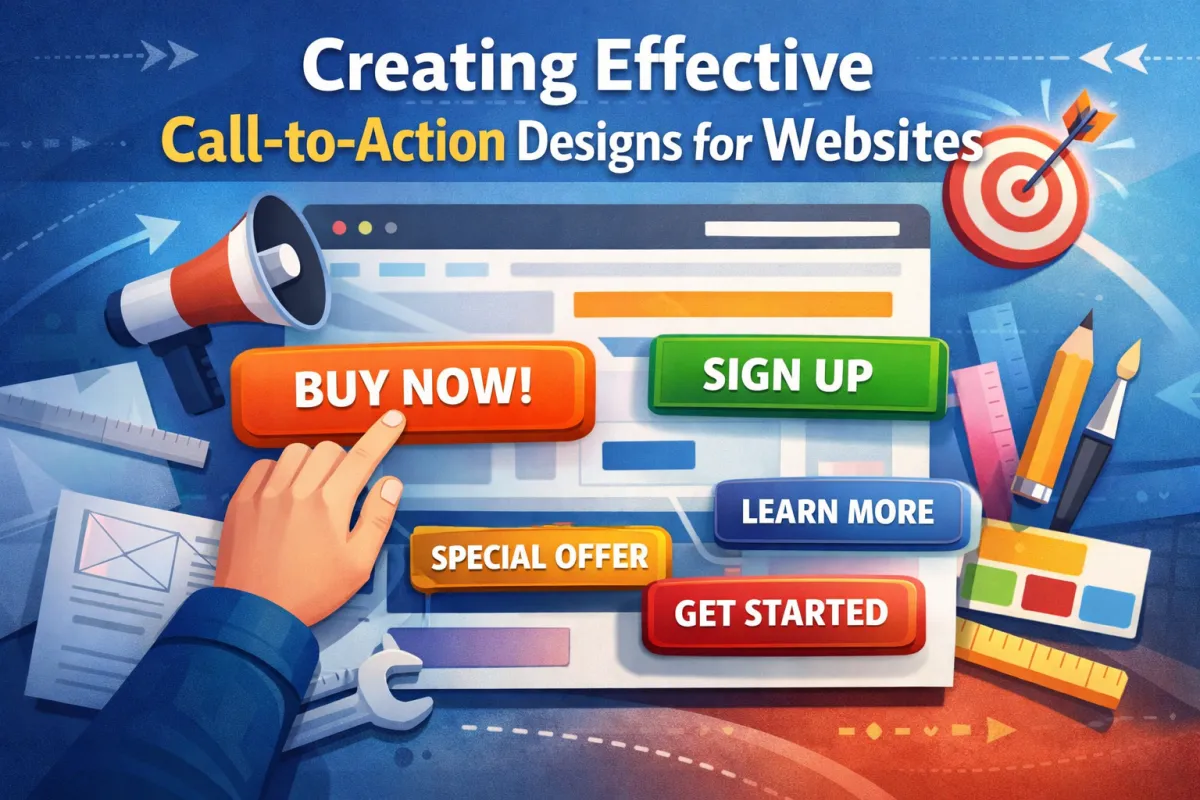
Creating Effective Call-to-Action Designs for Websites
In this guide to Creating Effective Call-to-Action Designs for Websites, we unpack the essential elements that turn passive browsers into active buyers. You'll learn how to use visual hierarchy, button design, and placement strategy to drive clicks. We cover copywriting best practices, technical implementation, conversion psychology, and modern metrics like CTR and scroll depth. Whether you're adding a sticky banner, refining microcopy, or running A/B tests, this article gives you the full blueprint for designing CTAs that convert. Get ready to optimise your user journey and build a frictionless experience that supports your entire funnel strategy.
The Real Purpose of a Call-to-Action (CTA)
A Call-to-Action (CTA) is more than just a button — it’s a gateway to conversion. It bridges your site visitor’s curiosity with your business goal, whether that’s completing a purchase, signing up for a newsletter, or downloading a guide.
But in today’s competitive digital landscape, a CTA needs to do more than exist — it needs to stand out, be persuasive, and be strategically placed to guide the user without distraction or confusion.
“A well-designed CTA is like a great salesperson: clear, timely, and impossible to ignore.”
At Easy Ecommerce Marketing, we understand how deeply impactful a single CTA can be across a brand’s website. From homepage to blog, the CTA is where your design meets your revenue goals.
Design & Visual Elements: Where Conversion Begins
Before your visitor even reads the CTA copy, they see it. That’s where visual design does the heavy lifting. Let’s break down the must-have components of high-performing CTA visuals.
1. Button Design That Works
Your CTA must look clickable. Use:
Rounded corners or raised effects
Clear border radius for tactile appeal
Animations or hover states to signal interactivity
And always make sure the button is large enough to tap on mobile — mobile-first design isn’t optional anymore.
2. Visual Hierarchy & Color Contrast
An effective CTA draws attention without shouting. Use color contrast that complements your brand palette but stands out against the background.
Use visual hierarchy to prioritize CTA elements over less critical content.
Stick with bold but limited color combinations for clarity.
For example, your primary CTA (“Buy Now”) should visually dominate over secondary actions like “Learn More.”
3. Whitespace: Give It Room to Breathe
Designers often fear blank space, but whitespace around a CTA enhances focus. A crowded page leads to choice paralysis, while whitespace signals importance and invites interaction.
Strategic CTA Placement: Context Is Everything
Even the most beautiful button fails if it’s in the wrong place. Placement strategy is one of the most underestimated elements in CTA design.
4. Homepage Hero CTA
Your homepage hero section is often the first impression. Use a high-contrast CTA here, such as:
“Get Your Free Audit” – available here
But remember: not all users are ready to act immediately. Offer contextual relevance — perhaps a soft lead magnet for early-funnel visitors.
5. Persistent Navigation CTA
A persistent CTA in the top-right nav (like “Start Your Trial”) keeps your key goal visible across the entire user journey. Don’t bury your most important conversion point — elevate it.
6. Slide-in & Pop-up CTA Triggers
Use scroll-triggered or exit-intent CTAs to engage visitors at key moments. Examples:
Slide-in CTA appears after 50% scroll
Pop-up CTA triggers when mouse moves toward the browser bar
These are great for retargeting CTA use cases or soft conversions like “Download Our Guide.”
Pro Tip: Use A/B testing to experiment with timing, design, and CTA copy for these interactions.
Copywriting & Microcopy: The Language of Action
Once your design catches the eye, your words must seal the deal. That’s where action-oriented language and emotional motivators come in.
7. Clarity Beats Cleverness
Clarity always wins. For example:
✅ “Download Your SEO Checklist”
❌ “Unlock the Secrets”
Make sure your CTA answers the user's internal question: "What do I get if I click?"
8. Use Urgency & Emotion Without Manipulation
Examples of urgency cues:
“Offer Ends Tonight”
“Only 3 Spots Left”
Pair this with benefit-led copy:
“Book a Consultation to Grow Your Sales”
“Get Expert Help, No Cost”
You can see an example of emotionally intelligent CTA copy on our Services page.
9. Personalisation & Dynamic CTAs
Modern CTAs can adjust based on the viewer’s:
Location
Device
Referral source
On-site behavior
This kind of smart content transforms static experiences into dynamic CTAs, helping boost conversion rate and time to click.
Example: Returning visitors might see “Pick Up Where You Left Off” instead of “Start Now.”
Technical & Functional Power Behind Every CTA
A compelling CTA doesn't just look good and sound persuasive — it functions flawlessly behind the scenes. To maximise conversions, the technology supporting your CTA must be as refined as the design.
10. HTML vs Software-Generated CTA: Which One?
There are two main ways to implement CTAs:
HTML CTAs: Clean, fast-loading, and flexible. Ideal for standard buttons in nav menus, blogs, or footers.
Software-generated CTAs: Created via tools like HubSpot or ActiveCampaign. Perfect for A/B testing, campaign alignment, and advanced targeting rules.
If your goal is to track performance across multiple traffic sources and dynamically alter the CTA based on the user’s behavior, software CTAs are the better fit. But for core UX and mobile-first loading speed, HTML CTAs win.
11. Performance Tracking: Know What Works
To optimise your CTAs, you need to measure everything. Key metrics include:
Click-through rate (CTR) – How many saw it vs. clicked
Conversion rate – Did they take the next step?
Time to click – How fast did they engage?
Scroll depth – Are CTAs placed where users actually reach?
Bounce rate after click – Are people bailing post-CTA?
Use tools like heatmaps to understand interaction zones and session replay to see where visitors struggle or hesitate.
12. Accessibility: Design for Everyone
Making your CTAs accessible isn’t just a best practice — it’s a legal and ethical necessity. Align with WCAG standards by ensuring:
High color contrast for readability
Keyboard navigation and tab-index control
Clear button labels (avoid “Click Here”)
Support for screen readers and focus indicators
Minimise excessive motion or use motion sensitivity options
“A CTA can’t convert if a user can’t perceive or interact with it.”
Inclusivity is one of the fastest-growing ranking factors — accessibility improves SEO and user trust simultaneously.
Conversion Psychology & UX: Why They Click
Understanding the psychology behind CTAs is the secret weapon most brands ignore. Let’s explore how to move users emotionally and cognitively through your funnel.
13. Narrative Framing: Set Up the CTA
Every good CTA is part of a story. Users must understand:
What’s the problem?
Why are you the solution?
What should they do next?
For example, instead of:
“Book a Demo”
Try:
“Struggling with abandoned carts? Let’s fix that together — Book a Demo”
This setup aligns perfectly with the user intent and leads naturally into the conversion flow.
14. Trust Signals: Remove the Risk
Trust is fragile. Especially for bottom-of-funnel CTAs, adding subtle trust signals near the button increases engagement.
Use elements like:
SSL/security badges
Customer testimonials
Star ratings or review snippets
Privacy reassurances (e.g., “We never spam”)
“No credit card required” messaging
These signals ease anxiety and create a frictionless experience — vital for lead magnet CTAs or form submissions.
15. Psychological Triggers That Drive Action
People act when they feel, not when they think. Use emotional triggers to increase urgency and reduce hesitation:
FOMO CTAs: “Only 5 left in stock”
Benefit stacking: “Start free, cancel anytime, keep the bonuses”
Problem-solution framing: “Still not ranking on Google? Let’s change that.”
These techniques guide the user through problem recognition → solution offer → commitment.
Advanced CTA Techniques for Pro-Level Results
When you’re ready to go beyond the basics, these advanced strategies can take your call-to-action design from good to extraordinary.
16. Gamified CTAs & Exit Overlays
Engage users in a playful, interactive way:
Spin-to-win wheels
Quiz-based CTAs
Progress bars for gated content
Pair this with exit overlays to save abandoning users with a relevant offer or incentive.
Example: “Leaving already? Grab 10% off your first order.”
17. Multivariate Testing: Beyond A/B
While A/B testing lets you compare two variables (e.g., red vs. blue button), multivariate testing allows you to test combinations — like:
CTA copy
Button color
Placement
Microcopy nearby
This offers deeper insight into which CTA hierarchy actually drives results.
18. Lifecycle Stage Targeting & Segmentation Logic
Not all visitors are equal. Use segmentation logic to match CTAs to the user’s funnel stage:
First-time visitors: “Learn how we helped brands like yours”
Returning users: “Continue where you left off”
Cart abandoners: “Come back and save 10%”
This granular targeting supports your overall funnel strategy and improves conversion rate across the board.
CTA Design in Action
If you want to see CTA strategy in a real-world marketing context, our internal pages are built using these very principles.
Explore our ecommerce marketing services to see how CTAs are used to guide different user segments
Try out our Free Audit CTA — it’s a prime example of contextual placement with high clarity and minimal friction
Designing a CTA Ecosystem: Beyond the Button
A high-performing website doesn’t rely on just one CTA to do all the heavy lifting. Instead, it deploys a network of coordinated CTAs, each tuned to a different intent stage of the user journey.
Think of it like a symphony — each CTA has its own part, but together they move users forward, seamlessly and strategically.
19. Top Navigation CTA: Your North Star
Your persistent navigation CTA should represent your primary business goal. This is often:
“Book a Demo”
“Start Free Trial”
“Get a Quote”
At Easy Ecommerce Marketing, our nav CTA supports lead generation by linking to key service areas — ensuring visibility across all device types.
Best practices:
Keep it short (2–4 words max)
Use action verbs and clear expectations
Make it stand out visually using color contrast and hover states
20. Homepage Hero CTA: Command Attention, Not Confusion
This is your digital handshake. A homepage hero CTA should:
Align with the primary goal of your site
Reinforce your UVP (Unique Value Proposition)
Be clear, not clever (clarity over creativity)
Avoid cluttering the hero area with multiple competing CTAs. If needed, provide a secondary link with less visual weight, or direct users to scroll down for more.
CTAs in Content: Blog Posts, Guides & SEO Pages
Your content is a prime conversion asset — don’t waste the opportunity with poor or misplaced CTAs.
21. In-Content CTAs: Contextual, Subtle, Strategic
For example, on a long-form blog post about email automation, embed a CTA like:
“Want to improve your ROI with less effort? Explore our ecommerce marketing services.”
These in-content CTAs should appear:
After the intro (for skimmers)
Around 40–60% scroll (where dropoff spikes)
Just before or after solving a key user problem
Use a different design format (like a stylized box or contrasting background) to make them pop without interrupting the flow.
22. End-of-Post CTAs: Capture High-Intent Users
If someone finishes your article, they’re primed for deeper action. Offer a lead magnet CTA or a high-value offer like:
“Get your personalised traffic audit today — free.”
Claim Your Free Audit
Pair it with benefit-led microcopy, such as:
“Takes 60 seconds. No commitment.”
“We’ll show you 3 ways to double your revenue.”
This CTA strategy builds on problem-solution framing and uses emotional motivators to prompt conversion.
Don’t Forget the Footer: Low-Friction, High-Utility CTAs
Footer CTAs are often overlooked — but for users who scroll all the way down, they act as a final checkpoint.
23. What to Include in a Footer CTA:
“Talk to an expert”
“Subscribe for more growth tips”
“Download our free playbook”
Keep it simple. Use a single CTA with minimal fields. For example, just name and email — to reduce form abandonment rate and encourage micro-conversions.
You can also experiment with lazy loading your footer CTA or using progressive disclosure to minimize cognitive load.
Your CTA Readiness Checklist (Before You Publish)
Use this checklist before deploying a CTA on any landing page, blog, or homepage section:
Purpose: Does this CTA map to a clear business or user goal?
Design: Is it visually distinct using color contrast, typography, and whitespace?
Placement: Is it contextually aligned with where the user is in their journey?
Copy: Is the language clear, benefit-led, and action-oriented?
Responsiveness: Is it mobile-first and accessible across all screen sizes?
Tracking: Are you capturing metrics like CTR, conversion rate, and time to click?
Testing: Have you run A/B or multivariate tests to optimise?
Accessibility: Does it meet WCAG standards (keyboard, screen reader, tab-index)?
Trust: Are there trust signals nearby to reduce anxiety?
Performance: Does the page load quickly (especially for mobile users)?
Final Thoughts: Build CTAs That Click
Creating effective call-to-action designs for websites isn’t about chasing trends — it’s about creating a seamless blend of strategy, psychology, and user empathy. When done right, CTAs stop feeling like sales tactics and start feeling like helpful next steps.
From sticky banners and pop-up CTAs, to subtle in-content nudges and smart segmentation, every CTA should guide users along their conversion flow — not shove them.
Whether you're optimising an ecommerce store, lead gen site, or a content-rich blog, your CTA is your closer. So design it with care, test it with rigor, and trust your users to do the rest — if you've given them enough reason to.
Frequently Asked Questions: Creating Effective Call-to-Action Designs for Websites
1. How long should my CTA be?
A CTA should be short, specific, and actionable — ideally between 2 to 6 words. Longer CTAs tend to lose impact and visual clarity. The key is clarity over cleverness. For example, “Download Free Guide” or “Book a Strategy Call” outperforms vague CTAs like “Click Here”.
2. Should I use images or icons in my CTAs?
Yes, but with intention. Directional icons (like arrows) or icons that represent the action (like a download symbol or calendar icon) can increase clickability. However, avoid decorative elements that don’t reinforce the CTA’s purpose, as they can dilute focus or confuse users.
3. Is it better to use one CTA per page or multiple?
Use one primary CTA per intent stage on a page. For example, a product page might include:
A primary CTA: “Buy Now”
A secondary CTA: “Add to Wishlist”
More than two CTAs can cause decision fatigue and reduce conversions. If you need to present more options, consider progressive disclosure or use soft CTAs throughout longer-form content.
4. What is the difference between a primary and a secondary CTA?
A primary CTA represents your main conversion goal (e.g., “Start Free Trial”), while a secondary CTA supports alternative actions (e.g., “Learn More” or “Read Case Study”). Use design cues like size, color, and position to visually distinguish them.
5. Should CTAs open in a new tab or the same window?
For external links, use a new tab to avoid losing users. For internal navigation, open in the same window to maintain a smooth flow. For forms or gated content, consider what offers the least friction and test both options based on bounce rate after click.
6. How do I measure the success of my CTAs?
Track these core metrics:
CTR (Click-Through Rate)
Conversion Rate
Time to Click
Scroll Depth (to measure visibility)
Bounce Rate after Click
Use tools like Google Analytics, heatmaps, and session replay software to capture insights and identify drop-off points.
7. How often should I update my CTAs?
You should review and test CTAs at least quarterly, or:
After launching a new campaign
After a major design update
When performance metrics decline
Even small changes in copy, color, or placement can lead to significant improvements.
8. Can I use the same CTA across different pages?
You can, but it’s often more effective to tailor your CTA to match the content and intent of each page. For example:
On a pricing page: “Compare Plans”
On a blog post: “Download the Full Guide”
On a service page: “Request a Proposal”
Contextual CTAs drive more meaningful conversions.
9. What’s the best color for a CTA button?
There’s no universal "best" color — the key is contrast. Your CTA should stand out from surrounding elements. Red, orange, green, and blue are common choices, but they must complement your brand palette and meet accessibility contrast guidelines.
10. Can CTAs negatively affect user experience?
Absolutely. Poorly placed or overly aggressive CTAs (like multiple pop-ups, autoplay overlays, or misleading copy) can frustrate users, trigger distrust, and increase bounce rates. Always prioritize user intent and journey alignment, and aim for a frictionless experience.
