
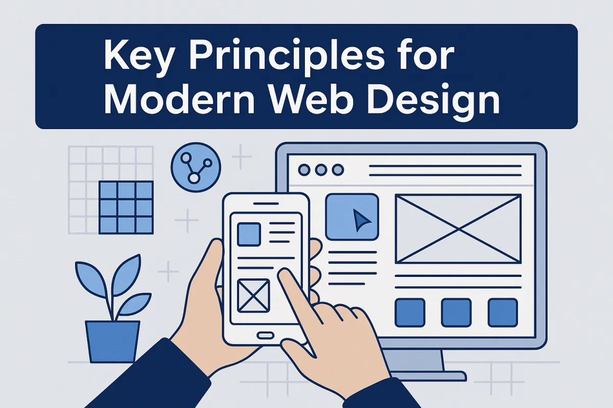
Key Principles for Modern Web Design
Modern web design isn't just about good looks—it’s about meaningful, measurable results. From how your users navigate your site to the emotional signals your typography sends, great design is built on a handful of timeless, strategic concepts. This article distills them into practical insights you can apply immediately.
Here’s what you’ll learn:
Why user-centricity beats aesthetics every time
How visual hierarchy shapes decisions
The role of simplicity in increasing engagement
What it means to be truly mobile-first
How smart design improves conversion paths and site performance
Tips for creating effective content architecture
And the one principle that makes or breaks any design: testing
Whether you’re redesigning a product page or launching a fresh store layout, these ideas will anchor your approach.
Designing for Humans, Not Just Browsers
The internet has become crowded. Brands fight for attention on every scroll, swipe, and click. But the sites that stand out—the ones that convert visitors into customers—are built with one foundational truth: design for people.
That’s the heart of user-centric design. Your audience isn’t looking for clever animation or complex features. They’re looking for clarity, ease, and trust.
“Design is marketing. Design is your product and how it works.” — Peep Laja
At Easy Ecommerce Marketing, we don’t just offer marketing services—we build digital environments where visitors feel understood. And that starts with usability.
Usability: More Than Just UX
Think of usability as the glue that holds your design together. It answers:
Can users accomplish their goals without frustration?
Is the navigation intuitive or confusing?
Do call-to-action buttons appear when and where they’re needed?
These aren’t design extras—they’re the core mechanics of online performance.
Here’s how you can enhance usability in your store:
Limit choice overload: Don’t make users think twice. Use streamlined navigation and familiar labels.
Prioritize user flow: Guide visitors from interest to checkout without friction.
Place feedback elements: Microinteractions—like a form confirmation—keep users engaged and informed.
Need help identifying usability gaps? Our free audit digs deep into your store’s performance signals.
The Visual Science Behind Attention
While functionality drives performance, it’s visual hierarchy that gets users to pause and act.
Designing Visual Paths, Not Just Layouts
Every website tells a visual story. But not all stories are worth reading.
A well-designed interface guides the eye, directing attention from key headings to product features, then to your conversion actions (e.g., “Add to Cart” or “Book a Call”).
This is where Gestalt principles come in—psychological rules that explain how people naturally group visual elements. When used well, they:
Establish logical groupings (like product benefits in columns)
Increase scannability (via spacing and symmetry)
Support emotional design through balance and proportion
White space, for instance, isn’t wasted space. It’s what gives elements room to breathe—elevating important sections and enhancing overall readability.
Explore how we implement these concepts in our full-service offerings at Easy Ecommerce Marketing Services.
Make Simplicity the Strategy
Contrary to what many assume, effective design isn’t about cramming in features. It’s about subtracting anything that doesn’t serve the user.
Simplicity does a few powerful things:
Reduces cognitive load
Increases task completion
Supports progressive enhancement (where essential functions work first, then polish is added)
When in doubt, go back to the essentials:
Clear headings
Obvious CTAs
Fast-loading assets
Mobile-first layouts
Logical information architecture
Pro tip: Map your product pages using the Rule of Thirds—placing product imagery and CTA hotspots along key visual intersections. It’s a subtle but impactful way to drive engagement.
Function Meets Form: Technical Precision in Design
If you’ve ever clicked away from a website because it loaded too slowly or looked broken on mobile, you already understand the importance of functionality and performance. Visual beauty means little if the site doesn’t work—and work fast.
Mobile-First Isn’t Optional
Over half of ecommerce traffic is mobile. That’s why responsive design isn’t a feature—it’s a baseline.
When designing mobile-first:
Prioritize thumb-friendly navigation and large tap targets
Reduce reliance on heavy graphics that slow load time
Hide or collapse secondary features to keep the layout focused
It’s also a principle of progressive enhancement: build for the lowest common denominator, then enhance for richer experiences on capable devices.
Here’s an example: if a visitor lands on your product page from Instagram, they should immediately see product images, the name, price, and a quick-buy CTA—without zooming, scrolling endlessly, or hunting for info.
We believe that exceptional performance is directly tied to smart design systems. And when you build responsively from the start, you avoid costly rework down the line.
Accessibility: Design for Everyone
Modern web design must account for all users—including those using assistive technologies. Accessibility isn’t only ethical and inclusive—it’s also increasingly a legal and SEO concern.
Accessible design considerations:
Ensure color contrast ratios meet readability standards
Use proper HTML semantics (like
h1,aria-labels, andaltattributes)Design keyboard navigable interfaces (no mouse required)
This ties directly into typography choices, too. A beautiful font is useless if it’s too small, too thin, or too faint.
“Accessibility is usability for everyone.”
— and good usability is good business.
Organize Like a Librarian: Content-First Strategy
One of the most overlooked parts of web design is information architecture—the structure and logic of your content. When done poorly, even beautiful websites feel scattered. When done right, users effortlessly find what they need.
This means:
Grouping content in intuitive categories
Creating paths that reflect user intent (browsing vs. buying)
Reducing steps between homepage and checkout
Our approach at Easy Ecommerce Marketing is content-first. Before you even think about colors or fonts, your site should be answering this question: What does the user want to know, and when do they want to know it?
That’s how we turn traffic into conversions—by aligning your content structure with user flow.
Want to see how your current architecture holds up? Use our free audit tool to pinpoint friction in your design and content journey.
Write for Humans (and Algorithms)
Let’s be honest—most web copy is skimmed, not read. That’s why effective writing in web design uses:
Short paragraphs
Descriptive headings
Bullet points and visuals to break up information
It’s not just about tone; it’s about scannability. Good content should also support a solid SEO structure, helping both users and search engines understand what’s on the page.
Here are quick fixes that make a big difference:
Replace vague CTA text (“Click here”) with specific actions (“Download Free Guide”)
Structure product pages with consistent
h2,h3, and meta descriptionsFront-load important information (don’t bury it in a long intro)
We apply these writing best practices across all our client stores—from services pages to product copy—because words sell.
Conventions Build Trust, Not Boredom
Innovative design is exciting—but unfamiliar UX is dangerous. That’s where design conventions shine.
Shoppers expect:
Navigation at the top or left
Contact info in the footer
Product images on the left, buy buttons on the right
Breaking these rules can cost you conversions. Instead of reinventing the wheel, use conventions to your advantage. Focus your creativity on emotional connection, branding, and polish—not re-teaching people how to shop.
By aligning your design with user expectations, you reduce cognitive load, increase comfort, and speed up decision-making.
When in doubt, test before you guess.
The Emotion Behind Every Click
Not all decisions are rational—especially online. Great web design taps into emotional design, creating subconscious connections that influence trust, engagement, and ultimately, purchases.
More Than Pretty: Feel Something
Design choices like color palettes, imagery, microinteractions, and tone of voice all contribute to how your brand feels. This is the difference between a sterile product grid and a compelling storefront that tells a story.
Here’s how to harness emotion:
Use lifestyle images instead of generic product shots
Write headlines that speak to pain points, not just features
Employ subtle animations or hovers that make the site feel alive
You don’t have to go overboard. In fact, restraint often communicates confidence. The goal is to create a mood—whether that’s sleek and professional, cozy and artisanal, or playful and bold.
This is something we incorporate into all client strategies at Easy Ecommerce Marketing—because we know that design that makes people feel something performs better than design that just functions.
Data-Driven Design: Testing Is the Real MVP
There’s no such thing as a “perfect” design. But there is such a thing as a tested one. And that’s what separates guesswork from growth.
A/B testing (also known as split testing) allows you to run controlled experiments:
Which headline leads to more email signups?
Does changing your button color increase conversions?
Will a new layout reduce cart abandonment?
Every element—from font size to call-to-action placement—can (and should) be tested. But don’t just test everything at once. Start with high-impact areas:
Homepage hero section
Product page CTA
Checkout funnel
Testing is iterative. You test, you learn, you tweak, and then test again. Over time, these micro-optimizations compound into meaningful revenue gains.
Need expert help setting up a test-driven funnel? That’s exactly what we do in our services.
Build to Scale: Design Systems That Grow With You
As your ecommerce business evolves, your website must adapt. That’s where design systems come in—a set of reusable components, styles, and rules that ensure consistency, efficiency, and scalability.
Why they matter:
Reduces time and cost for updates
Maintains brand identity across pages and devices
Keeps your UX consistent, even as your team grows
A solid design system might include:
UI components (buttons, cards, navigation bars)
Typography and color rules
Grid and spacing structures
Documentation for developers and designers
You don’t need a massive enterprise setup to benefit. Even small brands can create a simple style guide and component library to future-proof their design process.
If you’re unsure where to begin, our free audit can help assess your current design maturity and offer a roadmap for improvement.
In Summary: Design with Purpose, Not Just Style
Modern web design is more than layout. It’s a strategic tool that connects your brand to your customers through trust, clarity, and experience.
Let’s recap the key ideas that truly matter:
Put users first: Design for how people think, not how you wish they’d behave
Guide the eye: Use visual hierarchy and white space intentionally
Design for action: Make your CTAs clear, timely, and relevant
Build for all: Ensure accessibility, mobile-friendliness, and fast performance
Structure with intent: Organize content for clarity and search visibility
Test, test, test: Let data validate your assumptions
Grow with systems: Use design standards to scale your store
Want a real-time evaluation of how your site measures up? Visit our homepage and let us show you what modern web design looks like when it’s done right.
Frequently Asked Questions About Modern Web Design Principles
1. What’s the difference between web design and web development?
Web design focuses on the visual layout, user experience, and interface, while web development involves the coding and backend work needed to make the design functional. Designers handle how things look and feel; developers make it work behind the scenes.
2. How often should I update or redesign my website?
A full redesign is typically recommended every 2–3 years, but you should continuously optimize based on analytics and user behavior. Regular updates to layout, content, and features ensure your site stays current with design trends, technology, and customer expectations.
3. What makes a homepage effective in modern web design?
An effective homepage:
Clearly communicates your value proposition
Has strong visual hierarchy
Offers simple and intuitive navigation
Includes a compelling call-to-action
Loads fast and looks great on all devices
It should instantly show users who you are, what you do, and what they should do next.
4. Is animation important in modern web design?
Subtle animation (like hover effects, loaders, or transitions) can improve interactivity and provide visual feedback, enhancing usability. However, overusing animation can hurt performance and distract users, so it should be used purposefully and sparingly.
5. What are microinteractions and why are they important?
Microinteractions are small design elements that respond to user actions—like a heart icon that animates when clicked. They:
Provide feedback
Add delight
Reinforce actions
They may seem minor, but they significantly boost user engagement and satisfaction.
6. How can modern design help reduce bounce rates?
Modern design reduces bounce rates by:
Making content easy to scan
Offering fast-loading, mobile-friendly layouts
Improving navigation and minimizing friction
Building trust through professional, clean visuals
When users feel confident and oriented, they stay longer and explore further.
7. Does color psychology really matter in web design?
Yes. Colors influence how users feel and behave. For example:
Blue builds trust
Red can trigger urgency
Green is calming or associated with growth
Your color choices should align with your brand identity and audience expectations.
8. How important is consistency in web design?
Consistency builds trust and makes your site easier to use. This includes:
Repeating layout patterns
Using consistent typography and colors
Keeping button styles uniform
Inconsistent design forces users to relearn elements on every page, increasing cognitive load.
9. What are common web design mistakes to avoid?
Top mistakes include:
Overcomplicated layouts
Poor mobile responsiveness
Slow load times
Lack of clear CTAs
Ignoring accessibility standards
Fixing these issues can dramatically improve performance and conversions.
10. How can I measure if my web design is working?
Track KPIs such as:
Conversion rate
Bounce rate
Time on site
Page speed
Form submissions
You should also collect user feedback and run usability tests to identify friction points.
