
Mastering Visual Hierarchy in Web Design
In this deep dive into Mastering Visual Hierarchy in Web Design, you’ll discover how to transform your website from cluttered and confusing to intuitive and high-converting. We unpack the design principles that shape human attention, dissect the psychology behind scanning patterns like the F-pattern and Z-pattern, and explore how elements like size, color, alignment, and whitespace influence behavior. We also introduce emerging concepts such as visual anchoring, the visual priority stack, and affordance mapping. Whether you're building an eCommerce brand or refining your landing pages, this article gives you practical tools and strategies—based on UX best practices and visual psychology—that will elevate your web design. Along the way, we’ll link to helpful services and resources available at Easy eCommerce Marketing, a brand that knows exactly how strategic design can turn browsers into buyers.
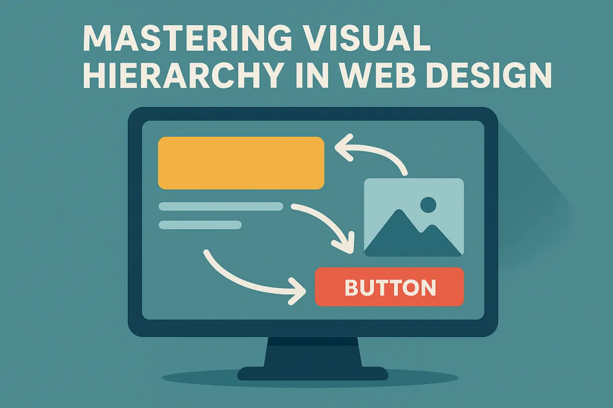
Why Visual Hierarchy is the Silent Persuader
Before a user reads a single word on your site, they’ve already made several unconscious decisions. They’ve scanned, judged, and either committed to scroll—or bounced. That’s the power of visual hierarchy in action. And mastering it isn’t about making things “pretty”—it’s about making things work.
“Good design is obvious. Great design is transparent.”
— Joe Sparano
At its core, visual hierarchy is about organizing content to match how users naturally scan and interact with a webpage. It's the silent persuader, the architectural blueprint of every successful online experience—from a headline that grabs attention to a call to action (CTA) that converts.
Understanding the Mechanics of Visual Hierarchy
The principles of UI design are deeply rooted in human psychology. We don’t view websites linearly—we scan them in predictable patterns. That’s why designers often lean on F-pattern and Z-pattern layout strategies, which follow how Western users typically read: top-left to top-right, down and across.
Here’s how scanning patterns play into your site's effectiveness:
F-patterns dominate content-heavy pages like blogs or product detail pages.
Z-patterns shine on minimalist homepages and landing pages, especially when directing users toward a CTA like a free audit.
When you're designing for conversion, these patterns become your visual roadmap—a way to predict and guide the user's eye.
Core Design Elements That Define Hierarchy
Let’s break down the design elements that establish hierarchy on the page:
1. Size & Scale
Bigger isn’t always better—but it is louder. Oversized headlines, hero images, and buttons dominate because our brains interpret them as more important.
Use it well:
Use large hero sections to capture attention.
Keep CTAs bold and generously spaced.
Avoid making everything “big”—that leads to content density and decision fatigue.
2. Color & Contrast
Color isn't just about brand aesthetics—it's a behavioral trigger. High contrast areas (think: white CTA on a black button) draw attention immediately.
Tactics:
Use color to separate primary and secondary actions.
Prioritize color contrast for accessibility and semantic structure.
Tap into emotional tone through brand-aligned hues.
For example, our eCommerce marketing services page uses warm contrast blocks to lead users toward service discovery and engagement.
3. Spacing, Alignment & Whitespace
Whitespace isn’t empty space—it’s strategic silence. It allows elements to breathe, reduces cognitive load, and increases readability.
Design for flow by:
Using consistent alignment to create rhythm.
Grouping elements with intentional spacing (a Gestalt principle called proximity).
Framing focal points (like a product or CTA) with surrounding whitespace.
Tip: Use the "squint test" to evaluate hierarchy. If your CTA or key message doesn’t stand out when blurred, something’s off.
Typography: More Than Just Fonts
Typography is one of the most underappreciated yet impactful parts of visual hierarchy. Through font weight, kerning, and typography hierarchy levels (H1, H2, H3), you signal importance, readability, and order.
Hierarchy through typography:
Use bold, large headlines (H1) to introduce sections.
Subheadings (H2–H3) guide scanning and improve interface scanning.
Consistent font styles improve recognition over recall, reducing mental friction.
Done well, typography becomes an invisible guide that leads your user where you want them to go—without them even realizing it.
Behavioral Triggers & Affordances
Ever hovered over a button and it subtly darkens? That’s a microinteraction, a small but mighty behavior trigger that reinforces affordance—the idea that something feels clickable.
In effective web design, affordance mapping ensures that users don’t have to guess what happens next.
Examples include:
Animating CTA buttons on hover
Iconography that signals functionality (like a magnifying glass for search)
Contrast shifts when inputs are focused or filled
These tiny details reduce user hesitation and increase interface confidence—making the user feel like they're in control.
Guiding the Eye with Interaction Patterns
Design isn’t static. The way users experience a site is dynamic, shaped by interaction patterns that align with natural reading flow and behavior. When we talk about Mastering Visual Hierarchy in Web Design, understanding these scanning patterns isn’t optional—it’s foundational.
F-Pattern vs Z-Pattern: When and Why
F-patterns are ideal for text-heavy environments such as blog pages, long-form product guides, or help centers. Users read across the top, then down the left edge, occasionally darting right to engage with standout content.
Z-patterns, on the other hand, dominate on minimalist landing pages where visual storytelling leads the experience. The eye moves in a “Z” shape from the logo, across to the navigation, diagonally to the body content, and then to the CTA.
The key takeaway: These patterns give structure to visual priority stacks, helping ensure that focal points land exactly where they should in the user’s journey.
Visual Rhythm, Layering & Composition
Beyond the surface, great hierarchy comes from a strong sense of visual rhythm and layering—creating tempo and flow as the user scrolls.
Imagine a homepage broken into visually distinct horizontal bands:
Hero section (large type, minimal elements, high contrast)
Social proof (logos or testimonials with consistent spacing)
Product features (icons + short text blocks)
Final CTA (strong contrast, whitespace framing)
This modular layout structure not only supports information architecture, but also increases scroll depth—one of the hidden UX metrics most closely tied to engagement.
Composition Tools You Can Use
Grids and columns: Use a consistent grid system to align text and imagery.
Zoning: Treat different parts of a page like zones with different levels of user intent.
Layering: Use overlapping visuals, shadows, or foreground images to build hierarchy without increasing content density.
At Easy eCommerce Marketing, our design philosophy includes these techniques in every landing page build. Each visual element has a job, and no section is wasted.
Accessibility: Inclusive by Design
Visual hierarchy isn’t just about sighted users. In fact, the best hierarchy works even when visual design isn’t visible. That’s where semantic HTML elements, screen readers, and inclusive design come in.
Build Accessible Hierarchy with:
Proper heading levels (H1 → H2 → H3) for screen reader navigation
Color contrast ratios that meet WCAG standards
Avoiding color-only indicators—use text + icons together
Text that’s resizable and readable on all devices
Incorporating these principles not only ensures compliance—it enhances the experience for everyone. Accessibility supports a universal design philosophy where hierarchy isn’t decorative—it’s functional.
Bonus: Accessible design often leads to better SEO, since search engines also rely on semantic structure and clear layout.
Emotional Engagement Through Visual Storytelling
The most successful brands don’t just “show” products—they tell stories through layout. That’s the role of visual storytelling, which uses imagery, tone, and rhythm to create an emotional arc.
For example:
A calm, minimalist layout with soft colors creates a sense of luxury and trust.
A bold layout with saturated colors and large CTAs evokes urgency and energy.
Whitespace + microcopy = intimacy and attention to detail.
This kind of emotional tone builds brand voice directly into the design, making your website feel intentional and authentic—every scroll of the way.
You can see this applied across various services and pages of our site, such as our home page, where every module is part of a larger brand narrative.
Measuring and Testing Hierarchy
Now that you’ve designed for intention, it’s time to validate with data. You can’t truly say you’re mastering visual hierarchy in web design without feedback loops.
Tools for Testing Hierarchy
Heatmaps: Show where users click, hover, and scroll. Great for visualizing what’s not working.
A/B Testing: Change one variable (button color, size, layout) to see how it impacts behavior.
Analytics: Monitor bounce rates, session durations, and scroll depth.
User Testing: Watch real users interact with your design and ask them what drew their attention first.
Squint Test: A low-tech gem—blur your screen or squint. If the right thing doesn’t “pop,” your hierarchy needs work.
If you’re unsure where your site stands, our team offers a detailed free audit that highlights hierarchy issues, UI gaps, and UX improvement opportunities.
Designing for Mobile: Hierarchy in the Palm of Your Hand
In a mobile-first world, hierarchy doesn’t shrink—it reshapes. Small screens demand tighter decisions. You can't rely on expansive whitespace or sprawling layouts. Instead, mobile hierarchy is all about clarity, stacking, and prioritization.
Mobile Hierarchy Tactics
Vertical stacking: Content should follow a clean, logical order—from headline to action.
Fixed CTAs: Use sticky navigation or anchored buttons to keep action visibility high.
Responsive typography: Scale headlines appropriately using relative units (
em,rem).Breakpoints: Optimize at key resolutions to avoid layout breaks or overlapping elements.
Remember: mobile users are often on the move. Their attention span is shorter, and their patience is thinner. That’s why mobile hierarchy must guide instantly, not gradually.
We always prioritize mobile hierarchy in our client work at Easy eCommerce Marketing, ensuring each design adapts seamlessly across devices—without sacrificing clarity or conversion potential.
Visual Anchoring, Attention Economy & the Power of Stillness
There’s a term you’ll hear more and more in UI/UX discussions: visual anchoring.
It refers to fixed focal points that give users a mental resting place—a moment of clarity in a scrolling experience. These can be:
A static headline that persists on scroll
An anchored image or product card
A consistent visual motif that reinforces brand presence
Why does it matter?
Because we’re designing in the era of the attention economy. Every second a user spends confused is a second closer to exit. Anchoring gives users context. It supports visual memory and helps them feel oriented—even in long, complex layouts.
Pair this with progressive disclosure—revealing content in stages—and you reduce cognitive load dramatically.
Example Use Cases
Homepage product highlight: Anchor a best-seller card just below the hero section.
Category pages: Use iconography and layout repetition to create recognizable visual rhythm.
Blog content: Design sticky table of contents or summary boxes for easier scanning.
Design Tokens, Consistency & the Invisible System
Behind every intuitive, beautiful interface is an invisible layer of consistency. That’s where design tokens come in—standardized variables that define things like:
Spacing units
Font sizes and weights
Brand colors
Border radius
Shadow styles
Using design tokens ensures visual consistency, making your hierarchy predictable and scannable—even as the site scales.
Predictability breeds trust. If a user knows what a CTA looks like once, they’ll trust it again.
Design tokens are the foundation of scalable design systems, and they help unify semantic structure, accessibility, and branding into one coherent language.
The Role of Brand Voice in Visual Hierarchy
Your brand voice isn’t just what you say—it’s how your design feels. Every hierarchy decision should reflect your brand’s:
Tone of voice
Visual identity
Emotional goal
Consider This:
A minimalist, premium brand may use soft contrast, serif typography, and generous whitespace to evoke sophistication.
A bold, energetic brand might lean into saturated color palettes, tight spacing, and dynamic microinteractions to drive urgency.
This alignment of form and feeling turns visual hierarchy into a brand story—one that users can read, feel, and remember.
You can see this approach reflected across the Easy eCommerce Marketing homepage, where design and messaging are perfectly integrated to guide attention and spark action.
Wrapping Up: Mastering Visual Hierarchy is Mastering Communication
At its core, Mastering Visual Hierarchy in Web Design isn’t just about layout—it’s about clarity, trust, and intent.
You are not designing a website.
You are designing a conversation.
Every element on the page should answer:
What do I look at first?
Why does this matter to me?
What should I do next?
Final Checklist for Strong Visual Hierarchy:
✅ Use size and scale intentionally
✅ Maintain color contrast and accessibility
✅ Align and space elements rhythmically
✅ Structure content with clear heading levels (H1–H3)
✅ Incorporate behavioral triggers and microinteractions
✅ Optimize for mobile hierarchy and vertical flow
✅ Test with real users using heatmaps and analytics
✅ Apply design tokens for consistency
✅ Reinforce brand voice and emotional tone
A beautiful website that fails to guide the user is like a stunning map with no compass.
By applying these principles and continuously testing them in the wild, your site won't just look good—it will perform with precision.
Need help translating these insights into actionable strategy? Get your free audit today and let us show you exactly how your visual hierarchy can convert more, bounce less, and communicate better.
Frequently Asked Questions: Mastering Visual Hierarchy in Web Design
1. Is visual hierarchy the same as layout design?
Not quite. While layout refers to the overall structure and arrangement of elements on a page, visual hierarchy is the intentional prioritization of those elements based on importance. Layout is how elements are placed; hierarchy is why they're placed that way.
2. How many levels of hierarchy should I use on a page?
A typical page should have 3–4 levels of visual hierarchy:
Primary: Headline or hero section
Secondary: Subheadings, key visuals, main CTAs
Tertiary: Body text, supporting visuals
Optional: Footnotes, disclaimers, secondary links
More than that can overwhelm users and dilute clarity.
3. Can animations affect visual hierarchy?
Yes, but use them strategically. Subtle animations like hover effects, transitions, or scroll reveals can enhance hierarchy by drawing attention. However, too much movement can distract from primary goals and damage usability.
4. How does visual hierarchy impact SEO?
Visual hierarchy impacts SEO indirectly by improving user engagement signals—like time on site, bounce rate, and page depth. Also, semantic HTML elements (H1, H2, etc.) help search engines better understand your content structure.
5. What’s the relationship between hierarchy and conversion rate optimization (CRO)?
Strong visual hierarchy simplifies decision-making by guiding users to conversion points (sign-ups, purchases, downloads). By reducing confusion and highlighting CTAs, you improve conversion rates significantly.
6. Can visual hierarchy help with reducing bounce rates?
Absolutely. A clear and intuitive hierarchy engages users faster, encouraging them to explore rather than abandon. Elements like concise headings, visual cues, and quick-scan formats can greatly reduce bounce.
7. How can I test if users understand my visual hierarchy?
Besides heatmaps and analytics, try first-click testing or five-second tests. These help identify where users think they should click or what stands out at a glance—both are great indicators of effective hierarchy.
8. How does whitespace differ from negative space in design?
They are often used interchangeably, but technically:
Whitespace: The intentional blank areas around design elements.
Negative space: Can refer more broadly to any empty area, including creative uses (like optical illusions or cutouts).
In hierarchy, whitespace is used to isolate and emphasize key elements.
9. How important is consistency in establishing hierarchy?
Consistency is critical. It trains users to recognize patterns. For example, if every CTA button is the same color and style, users know where to act without hesitation. Inconsistency breeds confusion and weakens the hierarchy.
10. What’s one common mistake designers make with visual hierarchy?
Trying to make everything stand out. If every element demands attention—through color, size, or animation—then nothing does. Hierarchy is about contrast and restraint: you need quiet moments so the loud ones speak louder.
