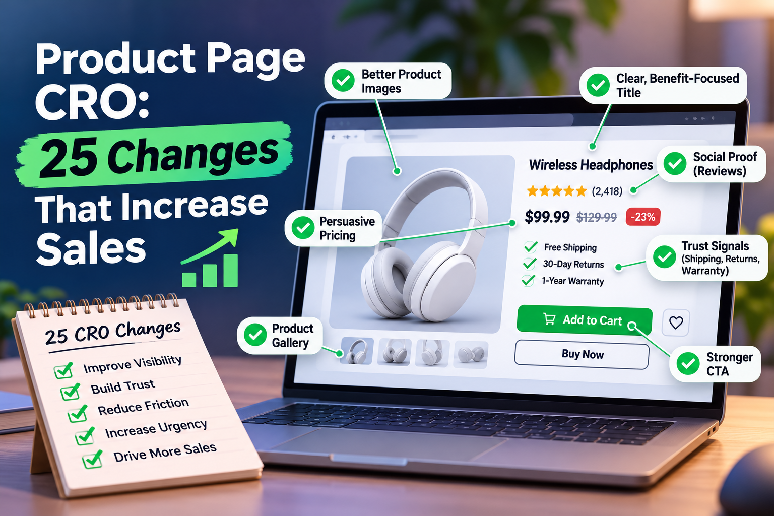
Product Page CRO: 25 Changes That Increase Sales
Product Page CRO: The Key Things You Need to Know
Your product page has one job: turn interested visitors into paying customers. Yet even a beautifully designed ecommerce store can lose sales because of unclear product descriptions, weak calls to action, poor imagery or unnecessary purchasing friction.
Product page conversion rate optimisation (CRO) is the process of improving individual product pages to encourage more visitors to add products to their baskets and complete purchases.
Here's what matters most:
-
Make your product's value immediately obvious. Clear headlines, persuasive descriptions and benefit-led messaging help shoppers understand why your product deserves their attention.
-
Show rather than simply tell. High-quality product photography, demonstration videos and visual storytelling reduce uncertainty and build purchase confidence.
-
Make buying effortless. Prominent add-to-cart buttons, sticky purchase controls and intuitive layouts help customers move towards checkout without unnecessary distractions.
-
Build trust before asking for the sale. Authentic customer reviews, user-generated content and transparent product information address common buying objections.
-
Optimise for mobile shoppers. Responsive product pages, readable content and touch-friendly buttons make purchasing easier on smaller screens.
-
Measure what actually improves sales. Track add-to-cart rates, completed purchases and revenue per visitor rather than assuming every design change increases conversions.
The most effective product page CRO strategy isn't about adding more buttons, pop-ups or persuasive tricks. It's about removing the reasons customers hesitate.
In this guide, we'll explore 25 practical changes that can increase product page conversions, improve the shopping experience and help your ecommerce store generate more revenue from the traffic it already receives.
Why Product Page CRO Matters More Than You Think
Imagine attracting 10,000 visitors to your ecommerce store every month.
You've invested in search engine optimisation, paid advertising, social media and content marketing. People are discovering your products, clicking through to your website and showing genuine buying interest.
But only a small percentage complete a purchase.
The problem might not be your marketing.
It could be your product pages.
A visitor who lands on a product detail page has already demonstrated some level of interest. They've moved beyond browsing a search result or scrolling through a social media feed. Now they're evaluating whether your product is worth buying.
This is where ecommerce conversion rate optimisation becomes particularly valuable.
Product page CRO helps you get more value from existing traffic rather than relying entirely on attracting additional visitors.
Consider a simplified example:
| Ecommerce metric | Before CRO | After CRO |
|---|---|---|
| Monthly product page visitors | 10,000 | 10,000 |
| Purchase conversion rate | 2% | 3% |
| Monthly orders | 200 | 300 |
| Average order value | £50 | £50 |
| Monthly revenue | £10,000 | £15,000 |
That's an additional £5,000 in monthly revenue, without increasing traffic.
Of course, this is an illustrative scenario rather than a guaranteed result. Actual performance depends on your products, traffic quality, pricing, customer expectations and the effectiveness of your changes.
Nevertheless, it demonstrates why improving conversion rates can be such a powerful commercial opportunity.
If you're unsure where your ecommerce store is losing potential sales, a free ecommerce website audit can help identify areas worth investigating.
What Is a Good Product Page Conversion Rate?
There's no universal benchmark that applies to every ecommerce business.
Conversion rates vary depending on factors such as:
-
Product category and average selling price.
-
Customer purchase intent.
-
Traffic source and audience quality.
-
Mobile versus desktop shopping behaviour.
-
Brand familiarity and customer trust.
-
Whether products are everyday purchases or considered investments.
A low-priced accessory might convert very differently from a premium piece of furniture.
That's why comparing your results against your own historical performance is often more useful than chasing an arbitrary industry average.
It's also important to distinguish between your product page conversion rate and your overall ecommerce conversion rate.
Your overall ecommerce conversion rate measures purchases against the relevant store-wide visitor or session total. Product page conversion rate focuses on the visitors or sessions that actually viewed a particular product page.
Use consistent definitions and analytics settings when comparing performance.
The Metrics That Reveal Product Page Problems
Before changing your product page design, establish what your current visitors are doing.
| CRO metric | What it tells you |
|---|---|
| Product page conversion rate | How effectively product page traffic turns into purchases |
| Add-to-cart rate | How often visitors add a viewed product to their basket |
| Cart abandonment rate | How frequently shopping baskets are left without a completed purchase |
| Average order value (AOV) | How much customers spend per completed order |
| Revenue per visitor | How much revenue your website generates relative to visitor numbers |
| Product page engagement | How shoppers interact with your product content |
| Checkout completion rate | How effectively shoppers finish purchasing after entering checkout |
These metrics help distinguish between different conversion barriers.
For example, a product page with plenty of views but very few add-to-cart actions might suffer from unclear benefits, poor product photography or uncompetitive pricing.
A product with a healthy add-to-cart rate but disappointing sales might indicate problems later in the buying journey.
The goal of CRO isn't simply to make your product pages look better. It's to understand why visitors hesitate, remove those barriers and make purchasing feel like the natural next step.
With that foundation established, let's explore the changes that can make a measurable difference.
25 Product Page CRO Changes That Can Increase Sales
1. Write Product Headlines That Communicate Value Immediately
Your product headline is often one of the first elements shoppers notice.
And it has a surprisingly important job.
It needs to confirm that visitors have found the right product, communicate what they're looking at and encourage them to explore further.
Unfortunately, many ecommerce businesses treat product titles as little more than inventory labels.
A headline such as:
"Premium Storage Box – Model 204"
might accurately identify the product, but it doesn't explain why someone should care.
Compare that with:
"Stackable Storage Box – Keep Your Home Organised Without Wasting Space"
The second version communicates a practical benefit while preserving the product's identity.
That's the principle behind effective product title optimisation.
How to Improve Your Product Page Headlines
Start by making sure your headline answers three questions:
-
What is the product?
-
Who is it suitable for?
-
What makes it useful or desirable?
You don't necessarily need to answer all three within the title itself. In many cases, a concise product name followed by a benefit-led subheading creates a cleaner visual hierarchy.
For example:
Product title: Everyday Waterproof Backpack
Supporting headline: Keep your essentials dry, organised and ready for whatever the day brings.
This approach works particularly well for brands selling their own products because it allows you to communicate your unique value proposition rather than competing on generic product names alone.
Product Headline CRO Best Practices
-
Use clear, recognisable product terminology.
-
Include an important differentiator where relevant.
-
Keep titles readable on mobile devices.
-
Avoid exaggerated claims that your product cannot substantiate.
-
Place supporting benefits close to the headline.
-
Maintain consistency between advertisements, search results and product page messaging.
CRO testing idea: Compare a straightforward product title with the same title supported by a short, benefit-focused subheading.
Measure whether the change improves add-to-cart behaviour and completed purchases.
Remember, your headline doesn't have to tell the entire story.
It simply needs to make shoppers want to hear the rest.
2. Invest in Product Photography That Removes Buying Doubts
Online customers can't pick up your product.
They can't feel the material, examine the finish or see how it looks in real life unless you show them.
Your product images must bridge that gap.
Poor photography creates uncertainty. Uncertainty creates hesitation. And hesitation can lead to abandoned product pages.
High-quality product photography is therefore much more than a branding exercise.
It's an essential part of ecommerce product page optimisation.
What Makes Product Images Convert?
A strong product image gallery should help customers understand what they're buying from several perspectives.
Consider including:
-
A clear primary image: Show the entire product against a clean, distraction-free background.
-
Multiple product angles: Let customers inspect the front, back, sides and relevant details.
-
Close-up photography: Highlight materials, textures, finishes and important features.
-
Lifestyle photography: Demonstrate how the product looks or works in a realistic setting.
-
Scale references: Help shoppers understand the product's actual dimensions.
-
Variant photography: Show accurate images for different colours, sizes or configurations.
The objective isn't simply to make your products look attractive.
It's to answer the visual questions customers might otherwise leave unanswered.
Make Product Image Galleries Easy to Use
Even excellent photography can underperform when the image gallery itself is frustrating.
Customers should be able to switch between images intuitively, zoom into relevant details and inspect products without losing their place on the page.
On mobile devices, consider swipe-friendly galleries, visible image indicators and layouts that don't require awkward pinching or excessive scrolling.
Image optimisation matters too.
Oversized image files can slow down your product pages, particularly on mobile connections. Use appropriately sized images, modern image formats where supported and responsive image delivery.
However, don't sacrifice essential visual detail simply to reduce file sizes.
CRO testing idea: Compare your current product gallery against a version that includes additional lifestyle images, close-ups or scale references.
Track add-to-cart rates and purchase conversions, not just image engagement.
If your product pages are difficult to navigate or visually inconsistent, improving the underlying ecommerce web design may be just as important as replacing the photographs.
3. Use Product Demonstration Videos to Show Your Product in Action
A photograph shows customers what a product looks like.
A video can show them what it actually does.
That's an important distinction.
Product demonstration videos can communicate movement, functionality, size, texture and real-world usability in ways that static images sometimes struggle to achieve.
For products that require explanation, a short demonstration may answer several customer questions in seconds.
Think about a kitchen gadget, for example.
A photograph can show its appearance. A demonstration can reveal how easily it operates, how much space it occupies and what the finished result looks like.
Suddenly, the customer has a much clearer picture of ownership.
Product Videos Worth Testing
Different video formats serve different purposes.
Product demonstrations show the item performing its intended function.
Lifestyle videos demonstrate how the product fits into everyday situations.
Feature walkthroughs explain important specifications, controls or design details.
Customer demonstration videos provide authentic examples of how real buyers use the product.
Comparison videos help customers understand differences between product variants or alternative solutions.
You don't necessarily need an expensive production team.
A well-lit, clearly recorded demonstration that answers genuine customer questions may be more useful than an elaborate promotional video that says very little.
Where Should Product Videos Appear?
For many ecommerce stores, the product image gallery is a sensible starting point.
A video thumbnail placed alongside your photographs allows interested shoppers to explore the product without interrupting the buying journey.
For more complex products, an additional demonstration further down the page may help explain specific features.
A few practical considerations:
-
Keep the opening seconds relevant and informative.
-
Show the actual product rather than relying on abstract promotional footage.
-
Include captions for accessibility.
-
Avoid unexpected autoplay with sound.
-
Ensure videos load efficiently.
-
Make playback controls easy to use on mobile.
CRO testing idea: Add a concise product demonstration to one of your highest-traffic product pages and compare performance against a suitable control.
Video engagement can provide useful supporting information, but the main objective remains increasing product page conversions.
4. Rewrite Product Descriptions Around Benefits, Not Just Features
Here's a common product page mistake.
Businesses explain everything their product contains but very little about why those details matter.
They list dimensions, materials, technical specifications and manufacturing processes.
All useful information.
But specifications alone don't always create desire.
Effective product descriptions connect features to outcomes.
Features Explain. Benefits Persuade.
Imagine you're selling an insulated travel bottle.
A feature-focused description might say:
Double-wall stainless steel construction with a 750ml capacity.
That's factual, but it leaves the customer to interpret the value.
A more persuasive version might say:
Keep your favourite drink at a comfortable temperature while you're commuting, travelling or spending time outdoors, with a generous 750ml capacity for fewer refills.
The second example connects the product's characteristics to everyday use. Any specific temperature-retention claim should, of course, be supported by product testing.
This is the foundation of benefit-driven copywriting.
A Simple Framework for High-Converting Product Descriptions
For each important feature, ask:
Feature → Practical advantage → Customer benefit
For example:
| Product feature | Practical advantage | Customer benefit |
|---|---|---|
| Adjustable shoulder straps | Customisable fit | Greater comfort during daily use |
| Machine-washable fabric | Easier cleaning | Less time spent on maintenance |
| Compact folding design | Takes up less storage space | Easier to store and transport |
| Rechargeable battery | Can be powered without disposable batteries | More convenient everyday use |
The exact claims should always reflect what your product can genuinely deliver.
Structure Descriptions for People Who Scan
Not every customer reads product descriptions from beginning to end.
Many scan the page looking for answers to specific questions.
Use a combination of:
-
A short, engaging opening paragraph.
-
Benefit-led bullet points.
-
Clear feature explanations.
-
Technical specifications where appropriate.
-
Relevant use cases.
-
Care instructions or compatibility details.
Avoid burying essential information inside large blocks of text.
At the same time, don't strip away valuable detail just to make your page shorter.
A high-converting product description gives customers enough information to make a confident decision without making them work unnecessarily hard to find it.
Product Descriptions and SEO Work Together
Strong product descriptions can also support organic search visibility.
Naturally incorporating relevant product terminology, descriptive attributes and customer-focused language helps search engines understand the page's subject.
However, keyword stuffing can make product copy awkward and less persuasive.
The best approach combines search intent with helpful, readable content.
If your store attracts visitors through organic search but struggles to convert them, your product descriptions should be reviewed alongside your wider ecommerce SEO strategy.
CRO testing idea: Rewrite a product description using benefit-led headings and scannable bullet points, then measure changes in add-to-cart rate and purchases.
5. Make Your Add-to-Cart Button Impossible to Miss
You've attracted the right visitor.
Your product looks appealing.
The description answers their questions.
Now they want to buy.
But where's the button?
It sounds like a minor problem, yet unclear calls to action can introduce unnecessary friction at one of the most important moments in the customer journey.
Your add-to-cart button should be immediately recognisable, easy to interact with and visually distinct from less important page elements.
What Makes an Effective Add-to-Cart Button?
Start with visibility.
Your primary call to action should stand out from surrounding text, navigation elements and secondary buttons.
That doesn't mean choosing the brightest colour imaginable.
It means creating sufficient visual contrast within your existing brand design.
Button size matters too, particularly on mobile devices.
A button that's difficult to tap can turn a simple purchase action into an irritating experience.
Add-to-Cart Optimisation Checklist
-
Use clear button text such as "Add to Basket" or "Add to Cart".
-
Position the primary CTA close to the price and product selection controls.
-
Make the button visually prominent without overwhelming the page.
-
Ensure adequate touch-target size and spacing.
-
Provide immediate feedback when an item is added.
-
Explain unavailable product options rather than leaving customers confused.
-
Avoid competing primary buttons that make the next step unclear.
For a UK-focused store, "Add to Basket" may feel more familiar to some customers, while "Add to Cart" remains widely recognised.
Neither phrase is universally superior.
The most useful choice is the one that aligns with your audience and existing shopping experience.
Don't Overcomplicate CTA Copy
Creative copywriting has its place.
Your main purchase button usually isn't it.
Phrases such as "Unlock Your Perfect Lifestyle" may sound exciting, but they can make a straightforward action less obvious.
Customers shouldn't have to interpret what clicking a button will do.
Clarity generally deserves priority over novelty.
What About Button Colour?
There's no universally highest-converting CTA colour.
A red button won't automatically outperform a green one. A black button isn't inherently better than a blue one.
What matters is how the button appears within the surrounding design.
Contrast, placement, clarity and consistency all contribute to effective call-to-action optimisation.
CRO testing idea: Test a more prominent CTA design against your current version while keeping other page elements unchanged.
Measure add-to-cart actions, checkout progression and completed orders.
A button that generates more clicks but fewer purchases isn't necessarily an improvement.
6. Introduce a Sticky Add-to-Cart Button for Mobile Shoppers
Mobile shoppers behave differently from desktop visitors.
They scroll through product photographs, explore reviews, check specifications and compare details using a much smaller screen.
By the time they've decided to purchase, the original add-to-cart button might be several screens away.
That creates an unnecessary extra step.
A sticky add-to-cart button solves this problem by keeping a purchase action accessible as customers scroll through the product page.
It's a particularly useful technique to investigate as part of Shopify product page CRO and wider mobile ecommerce optimisation.
How Sticky Add-to-Cart Buttons Work
A sticky CTA typically appears near the bottom of the mobile screen once the original purchase button has moved out of view.
Depending on the design, it might display:
-
The product name.
-
The current price.
-
The selected product variant.
-
A prominent Add to Basket button.
The objective is straightforward: make purchasing convenient without forcing customers to scroll back to the top.
Avoid Turning a Helpful Feature Into an Obstacle
Sticky purchase controls need careful implementation.
If they occupy too much screen space, obscure product information or overlap with cookie notices and customer support widgets, they can make the mobile experience worse.
They also need to account for products requiring size, colour or configuration selections.
If a customer hasn't chosen a required variant, the sticky CTA should guide them to make that selection rather than producing a confusing error.
A well-designed sticky button should feel like a convenience.
Not an interruption.
Does a Sticky Add-to-Cart Button Increase Sales?
It can improve access to the purchase action, but that doesn't guarantee a higher conversion rate.
Results depend on product type, page length, mobile layout and existing customer behaviour.
That's why testing matters.
Compare your existing mobile product page against a version with a sticky purchase control.
Look beyond button clicks to evaluate completed orders and revenue per visitor.
You should also check whether the new element affects mobile usability or page performance.
CRO testing idea: Introduce a compact sticky CTA that appears only after the original add-to-cart button leaves the viewport.
This helps you test the value of persistent purchase access without unnecessarily duplicating controls at the top of the page.
7. Put Customer Reviews Where They Influence Buying Decisions
You can tell customers that your product is excellent.
But hearing it from another customer often carries a different kind of credibility.
That's why customer reviews are such an important part of product page CRO.
They provide independent perspectives, address common concerns and help shoppers imagine what ownership might be like.
For unfamiliar brands, reviews can be especially valuable because customers may not yet have an established reason to trust the business.
Make Reviews Visible Early
Don't automatically hide customer feedback at the very bottom of the page.
Consider displaying an accurate average star rating and review count near the product title, with a link that takes visitors directly to the full reviews section.
For example:
4.7 out of 5 stars — Based on 86 customer reviews
This is an illustrative example; only publish ratings and counts that reflect genuine customer feedback.
A visible rating can provide a useful confidence signal while allowing shoppers to investigate the details when they want more reassurance.
What Makes Product Reviews More Useful?
Not all review content is equally informative.
Customers often want to know:
-
Does the product match its description?
-
Is the quality consistent with the price?
-
How does it perform during everyday use?
-
Is the sizing or fit accurate?
-
Are there any limitations worth knowing about?
-
Would previous buyers purchase it again?
Reviews that address these questions can help customers make better-informed decisions.
Include Balanced, Authentic Feedback
A page filled exclusively with vague five-star praise can sometimes feel less convincing than a collection of detailed, balanced reviews.
Authenticity matters.
Don't manufacture testimonials, suppress legitimate criticism simply because it's negative or create misleading impressions about customer satisfaction.
Where appropriate, allow shoppers to filter reviews by rating, recency or relevant product attributes.
Verified buyer labels can also help, provided your verification process genuinely supports the claim.
Make Reviews Part of the Buying Journey
Customer feedback doesn't have to exist in isolation.
You might highlight a particularly informative review near a relevant product feature or include a short customer quotation beside a demonstration video.
However, avoid cluttering the product page with repeated testimonials.
The purpose of social proof is to reinforce confidence, not distract shoppers from the purchase.
CRO testing idea: Compare a product page with reviews located only near the bottom against one that includes an authentic star rating and review count near the product title.
Measure whether making customer feedback easier to discover improves product page engagement and conversion performance.
8. Use Customer Photos and User-Generated Content to Build Authenticity
Professional product photography shows your product at its best.
User-generated content shows what it can look like in the real world.
Both have value.
And when used together, they can give customers a more complete understanding of what they're buying.
User-generated content (UGC) includes photographs, videos, reviews and other material created by customers rather than the brand itself.
For ecommerce businesses, this content can provide practical context that polished studio imagery sometimes lacks.
Why Customer Photos Matter
Imagine shopping for a backpack.
The official product images show a perfectly positioned bag against a clean background.
Helpful, certainly.
But you might still wonder how large it looks when worn, how it fits different body types or whether the colour appears the same in everyday lighting.
Customer photographs can help answer those questions.
They make the product feel more tangible.
Ways to Include UGC on Product Pages
Consider adding:
-
Customer photographs within the reviews section.
-
Short videos showing products in everyday use.
-
Real-life examples of product size or fit.
-
Customer-submitted styling or usage ideas.
-
Photo galleries linked to verified purchases.
For products with multiple variants, UGC can also help customers compare colours, sizes or configurations in realistic environments.
Keep User-Generated Content Genuine
Always obtain the necessary permission before reusing customer photographs or videos.
Make sure any incentivised content is appropriately disclosed and don't present paid promotional material as independent customer feedback.
Quality matters as well.
UGC doesn't need studio-level production, but it should still be relevant, understandable and genuinely useful.
Avoid overwhelming visitors with enormous galleries that make the page difficult to navigate.
Instead, select content that addresses common purchase questions.
Turn Customer Feedback Into Better Product Pages
UGC can reveal more than opportunities for social proof.
It can highlight information missing from your original product content.
If customers repeatedly upload photographs showing a product's size, perhaps your official images need better scale references.
If reviews frequently discuss a particular feature, consider making that benefit more prominent in your description.
And if customers regularly ask the same questions, your product page may need clearer explanations.
This is where customer feedback becomes a valuable source of conversion optimisation insight.
CRO testing idea: Add a small, carefully selected gallery of authentic customer photographs beneath your main product imagery or near the reviews section.
Monitor engagement, add-to-cart behaviour and completed purchases to understand whether the additional context helps shoppers make decisions.
9. Highlight Your Product's Biggest Benefits Above the Fold
You don't have long to make a strong first impression.
When someone lands on your product page, they should immediately understand what you're selling, why it's worth considering and how to take the next step.
If visitors have to scroll through several screens before discovering your product's main selling points, you're making them work harder than necessary.
That's where above-the-fold product page optimisation becomes important.
The term above the fold refers to the content visible before someone starts scrolling. On desktop, that might include a large product image, title, price and purchase button. On mobile, the available space is considerably smaller.
The challenge is deciding which information deserves that valuable space.
What Should Appear Above the Fold on a Product Page?
While every ecommerce store is different, a high-converting product page should generally prioritise:
-
Product title: A clear description of what the customer is viewing.
-
Primary product image: An attractive, accurate representation of the item.
-
Price: Easy to find and understand.
-
Key product benefit: A compelling reason to consider purchasing.
-
Customer rating: Authentic social proof, where available.
-
Product options: Relevant size, colour or configuration selectors.
-
Add-to-cart button: A prominent and accessible purchase action.
You don't need to squeeze every possible detail into the first screen.
In fact, trying to display too much can create the opposite problem.
A cluttered layout makes it harder for customers to distinguish between essential information and secondary details.
Use Visual Hierarchy to Guide Attention
Visual hierarchy describes how the arrangement, size, contrast and spacing of page elements influence what people notice first.
For product pages, a logical visual hierarchy might follow this sequence:
Product image → Product title → Main benefit → Price → Purchase options → Add to Basket
This creates a natural progression from interest to action.
However, the best order can vary depending on your products.
For example, a premium skincare brand might need to emphasise ingredients and suitability, while a technical electronics store may need to make compatibility information immediately accessible.
Don't Confuse More Information With More Persuasion
Some ecommerce businesses attempt to improve conversions by adding more banners, promotional labels, trust badges and marketing messages above the fold.
But more isn't always better.
Every element competes for attention.
If everything is highlighted, nothing stands out.
Focus on the information that helps visitors answer their immediate buying questions.
CRO testing idea: Test a simplified above-the-fold layout that prioritises the product image, core benefit, price and primary CTA.
Use heatmaps, scroll-depth reports and conversion data to evaluate whether shoppers find important information more easily.
10. Make Product Pricing Clear, Honest and Easy to Understand
Few things damage purchase confidence faster than unexpected costs.
A customer sees a product advertised at £39.99.
They like it.
They add it to their basket.
Then they discover additional charges they weren't expecting.
Suddenly, the purchase feels less appealing.
This is why pricing transparency plays such an important role in ecommerce conversion rate optimisation.
Customers should understand what they're paying before they commit to buying.
Make Your Product Price Immediately Visible
Your product price shouldn't be hidden beneath lengthy descriptions, promotional graphics or unnecessary interface elements.
Display it prominently near the product title and purchase controls.
If your product has multiple variants with different prices, make sure the displayed amount updates accurately when shoppers change their selection.
For example:
| Product option | Displayed price |
|---|---|
| Standard size | £29.99 |
| Large size | £39.99 |
| Extra-large size | £49.99 |
Illustrative pricing only.
This prevents confusion and helps customers understand the financial implications of their choices.
Be Careful With Discounts and Promotional Pricing
Discounts can encourage purchases, but misleading promotions can undermine trust.
If you're displaying a reduced price, make sure the comparison is accurate and complies with applicable pricing and consumer protection requirements.
For example:
Was £59.99 — Now £44.99
This communicates a potential saving clearly, provided the previous price and promotional claim are genuine and substantiated.
Avoid artificial countdowns, invented savings or perpetual discounts designed to create a false impression of urgency.
A strong product page shouldn't need misleading tactics to persuade customers.
Explain Additional Costs Before Checkout
Where relevant, clarify whether the displayed price includes VAT, whether delivery is charged separately and whether additional fees may apply.
You don't necessarily need to calculate every possible shipping scenario directly on the product page.
However, customers should have an accessible way to understand the likely total cost.
This is especially important for stores selling internationally or offering multiple delivery options.
Use Pricing to Reinforce Value
Price transparency doesn't mean competing exclusively on being the cheapest.
If your product costs more than similar alternatives, explain what customers receive for the additional investment.
That might include:
-
Higher-quality materials.
-
Specialist manufacturing.
-
Longer-lasting construction.
-
Additional functionality.
-
Extended warranty coverage.
-
Included accessories or support.
Only highlight benefits your product genuinely offers.
CRO testing idea: Compare your current pricing presentation against a clearer layout that includes relevant variant prices, accurate promotional information and a concise explanation of additional charges.
Measure whether improved price clarity increases checkout progression and completed purchases.
11. Show Delivery Costs and Estimated Arrival Dates Before Checkout
Your customer has found the perfect product.
They like the design.
The price feels reasonable.
They're almost ready to buy.
Then a question appears:
"When will it arrive?"
If the answer isn't easy to find, uncertainty can creep into the buying decision.
Delivery information is one of those practical details that may not feel particularly exciting from a marketing perspective.
But it can make a meaningful difference to purchase confidence.
Why Delivery Transparency Matters
Online shoppers often have specific expectations about when they need a product.
Someone buying a birthday present may need it before the weekend.
A customer ordering replacement equipment might need it urgently.
Another shopper may be perfectly happy waiting several days, provided they know what to expect.
The problem isn't always slow delivery.
It's uncertainty.
What Delivery Information Should Your Product Page Include?
Where possible, make the following details easy to access:
-
Available delivery methods.
-
Standard shipping costs.
-
Free delivery thresholds.
-
Estimated dispatch times.
-
Estimated delivery windows.
-
Relevant geographical restrictions.
-
Tracking availability.
For example:
Standard UK delivery: £3.95. Estimated delivery within 3–5 working days after dispatch.
This is illustrative wording. Your actual messaging should reflect your fulfilment capabilities and clearly distinguish dispatch times from delivery times.
Use Dynamic Delivery Estimates Where Appropriate
A personalised delivery estimate can be useful when your fulfilment system supports reliable calculations.
For example:
Estimated delivery: Thursday 12 November – Monday 16 November
However, inaccurate delivery promises can create customer dissatisfaction and increase support enquiries.
If you cannot reliably calculate an exact arrival date, communicate a realistic delivery range instead.
Make Free Shipping Thresholds Easy to Understand
If your store offers free delivery above a certain order value, explain that benefit clearly.
For example:
Free UK delivery on orders over £50.
This can help customers evaluate their total purchase cost and may encourage them to consider additional relevant products.
But avoid displaying a threshold that doesn't apply to the customer's delivery location or selected items.
Connect Delivery Information With Purchase Decisions
Delivery messaging is often most useful when positioned near the product price or add-to-cart button.
Customers shouldn't need to navigate to a separate policy page just to discover whether a product can arrive when they need it.
A short summary can link to more detailed information without overcrowding the product page.
CRO testing idea: Add a concise delivery information panel beneath your purchase controls.
Compare add-to-cart rates, checkout progression and completed orders against the existing design.
The objective is to remove uncertainty, not overwhelm shoppers with logistics.
12. Make Your Returns and Refund Policies Easy to Find
Every online purchase involves a degree of uncertainty.
What if the product doesn't fit?
What if the colour looks different in person?
What if it isn't suitable?
What happens if something arrives damaged?
These questions are particularly important when customers are purchasing from a brand for the first time.
A clear returns policy can help address those concerns before they become reasons to leave.
Why Returns Information Supports Product Page CRO
Customers aren't necessarily looking for an opportunity to return your product.
They're looking for reassurance that they won't be left without options if something goes wrong.
When returns information is difficult to find, shoppers may assume the process is complicated or restrictive.
That uncertainty can become a conversion barrier.
A transparent policy helps customers understand their rights and your business's procedures.
What Should Your Returns Information Explain?
Depending on your products and applicable legal requirements, relevant information may include:
-
The period during which eligible items can be returned.
-
How customers initiate a return.
-
Whether return postage charges apply.
-
Any product-specific conditions or lawful exceptions.
-
How refunds are processed.
-
When customers can expect their refund.
-
What happens if an item arrives faulty or damaged.
For UK ecommerce stores, it's important to distinguish between your voluntary returns policy and customers' statutory rights.
Your terms must not misrepresent or restrict legal consumer protections.
Keep the Message Simple
Customers shouldn't need to read several pages of legal wording to understand the basics.
A short summary near the purchase area might say:
Easy returns on eligible items. See our returns policy for full details and your statutory rights.
If your business offers a genuine extended returns window, you can make that benefit more specific.
For example:
30-day returns on eligible products.
Only use claims that accurately reflect your policies.
Consider an Expandable Returns Section
An accordion-style section can work well on mobile product pages.
It allows shoppers to access returns information when needed without adding excessive page length.
Common sections might include:
-
Delivery and returns.
-
Product care.
-
Warranty information.
-
Frequently asked questions.
The content should remain accessible to keyboard users and assistive technologies.
Don't Overpromise
Offering a generous returns policy may help customers feel more confident, but it also creates an operational commitment.
Your messaging must match what your business can consistently deliver.
A realistic, clearly explained policy is better than an impressive promise you cannot fulfil.
CRO testing idea: Introduce a visible returns summary near your product's purchase controls, linking to the complete policy.
Evaluate whether improved access to returns information reduces purchase hesitation and supports conversion performance.
13. Add Trust Signals That Make Customers Feel Confident Buying
Trust is easy to overlook when you're familiar with your own business.
You know your products.
You know your processes.
You know that your store is legitimate.
But a first-time visitor doesn't necessarily know any of those things.
They may have discovered your website through a search result, social media advertisement or product recommendation.
Before purchasing, they need enough confidence to share their payment information and trust you to deliver.
This is where product page trust signals become valuable.
What Are Ecommerce Trust Signals?
Trust signals are elements that help customers evaluate the credibility, reliability and legitimacy of an online store.
Examples include:
-
Authentic customer reviews.
-
Accurate business contact information.
-
Clear delivery and returns policies.
-
Recognisable payment methods.
-
Genuine product guarantees.
-
Secure checkout messaging.
-
Relevant certifications.
-
Transparent customer support options.
Not every trust signal needs to appear on every product page.
The goal is to provide relevant reassurance without making the interface feel cluttered.
Display Recognisable Payment Options
If your checkout accepts major payment cards or digital wallets, displaying accurate payment method information can help shoppers understand their options.
However, only display logos for payment methods your store genuinely supports.
Similarly, don't use security badges or certification logos unless you're authorised to display them and the associated claims are valid.
A decorative padlock graphic isn't proof of security.
Use Guarantees to Address Specific Concerns
A guarantee can be persuasive when it answers a real customer objection.
For example, customers purchasing an expensive electronic product may want clear warranty information.
Someone buying clothing may be more concerned about returns and sizing.
A shopper considering a premium homeware item might want reassurance about materials or manufacturing quality.
Match your trust messaging to the questions customers are likely to ask.
Show That There's a Real Business Behind the Store
Contact details, helpful customer service information and a credible brand story can all contribute to purchase confidence.
For a single-brand ecommerce store, this is particularly important.
Customers aren't simply comparing products.
They're also deciding whether they trust the business that makes and sells them.
A consistent brand identity, professional product presentation and transparent policies help reinforce that confidence.
Avoid Trust Badge Overload
It's tempting to surround the add-to-cart button with payment logos, guarantees, security symbols and promotional messages.
But too many competing elements can weaken the visual hierarchy.
Choose the signals most relevant to your audience.
A concise delivery reassurance, genuine customer rating and clear returns message may be more useful than a large collection of generic badges.
CRO testing idea: Introduce a compact reassurance section near your purchase controls, containing two or three relevant, verifiable trust signals.
Monitor completed purchases and revenue per visitor rather than assuming that additional badges automatically improve conversion rates.
14. Optimise Your Product Pages for Mobile Shoppers
Your product page might look excellent on a desktop monitor.
Beautiful photography.
Perfectly aligned buttons.
Plenty of space for descriptions, reviews and product specifications.
Then someone opens the same page on their phone.
The headline takes up half the screen.
The product options are difficult to select.
The purchase button is buried beneath several sections.
And the image gallery feels awkward to navigate.
Suddenly, that polished desktop experience becomes a frustrating mobile shopping journey.
This is why mobile-first product page design is a fundamental part of modern ecommerce CRO.
Mobile Optimisation Is More Than Responsive Design
A responsive product page adjusts its layout to different screen sizes.
That's important.
But mobile conversion optimisation goes further.
It considers how customers actually interact with a product page using their fingers, smaller screens and potentially slower connections.
A page can technically be responsive while still being difficult to use.
Mobile Product Page CRO Checklist
Review the following areas:
| Mobile element | What to improve |
|---|---|
| Product images | Make galleries swipe-friendly and easy to inspect |
| Headlines | Keep titles readable without excessive wrapping |
| Product descriptions | Use short paragraphs and clear subheadings |
| Purchase buttons | Provide comfortable touch targets |
| Variant selectors | Make sizes, colours and options easy to choose |
| Navigation | Reduce unnecessary distractions |
| Reviews | Allow customers to find relevant feedback quickly |
| Page performance | Minimise unnecessary loading delays |
| Checkout | Reduce repetitive typing and awkward form interactions |
Design for Thumbs, Not Mouse Pointers
Desktop visitors use precise mouse movements.
Mobile visitors generally rely on touch.
Buttons placed too close together can lead to accidental taps.
Tiny colour swatches may be difficult to select.
Dropdown menus can become frustrating if they require excessive interaction.
Make controls large enough to use comfortably, with sufficient spacing between interactive elements.
Prioritise the Mobile Purchase Journey
A mobile shopper should be able to:
-
Understand the product.
-
Inspect relevant images.
-
Review the price.
-
Select required options.
-
Add the product to their basket.
-
Continue towards checkout.
Every unnecessary step introduces another opportunity for friction.
This doesn't mean removing useful information.
It means presenting it in a way that supports the customer's immediate task.
Use Expandable Content Carefully
Accordion sections can help organise detailed product information on smaller screens.
For example:
Product Details
Size and Specifications
Delivery and Returns
Customer Reviews
However, don't hide essential buying information simply to create a cleaner appearance.
Customers should still be able to identify important product benefits, prices and purchase controls without unnecessary effort.
Analyse Mobile and Desktop Performance Separately
A product page change that works well on desktop may not produce the same results on mobile.
Segment your conversion data by device type.
Compare:
-
Add-to-cart rates.
-
Product page purchase rates.
-
Checkout completion.
-
Revenue per visitor.
-
Engagement with key product elements.
This can reveal whether mobile-specific usability problems are affecting sales.
CRO testing idea: Identify the highest-friction interaction on your mobile product page and improve that element first.
For example, simplifying a complicated variant selector may be more valuable than redesigning the entire page.
15. Improve Product Page Loading Speed and Core Web Vitals
Customers can't buy a product they struggle to view.
And even when a slow page eventually loads, delays can interrupt the shopping experience.
Product page speed is therefore both a technical performance issue and a potential conversion barrier.
Large image galleries, unnecessary scripts, third-party apps and poorly implemented interactive features can all contribute to slow loading.
The challenge is improving performance without sacrificing the content customers need to make confident buying decisions.
Why Page Speed Matters for Ecommerce CRO
Imagine a customer clicking an advertisement for a product they're interested in.
The page begins loading.
The main image takes several seconds to appear.
The purchase button shifts position.
Then a promotional widget loads and moves the content again.
Even if the customer stays, the experience feels less polished and predictable.
Slow or unstable interfaces can make browsing and purchasing more difficult.
Understand the Three Core Web Vitals
Google's Core Web Vitals provide useful measurements of important aspects of page experience.
| Metric | What it measures | Good performance threshold |
|---|---|---|
| Largest Contentful Paint (LCP) | How quickly the largest visible content element loads | 2.5 seconds or less |
| Interaction to Next Paint (INP) | How responsive the page is to user interactions | 200 milliseconds or less |
| Cumulative Layout Shift (CLS) | How much visible content moves unexpectedly | 0.1 or less |
These thresholds are assessed using the 75th percentile of relevant page visits.
They aren't direct guarantees of higher conversion rates, but they help identify performance problems that can affect usability.
Common Causes of Slow Product Pages
Product pages often contain more technical elements than simpler website pages.
Potential performance issues include:
-
Oversized product photographs.
-
Unoptimised video embeds.
-
Excessive third-party applications.
-
Heavy JavaScript execution.
-
Unnecessary tracking scripts.
-
Poorly configured fonts.
-
Render-blocking resources.
-
Large promotional pop-ups.
-
Inefficient product recommendation widgets.
Adding more conversion features isn't always beneficial if those features make the page noticeably slower.
Practical Ways to Improve Product Page Speed
Optimise product images. Use appropriately sized assets, responsive image delivery and efficient formats such as WebP or AVIF where suitable.
Prioritise visible content. Make sure important above-the-fold elements load promptly.
Lazy-load appropriate content. Defer off-screen images and media where practical, without delaying the main product image unnecessarily.
Review third-party applications. Remove unused widgets and investigate scripts that create significant performance overhead.
Reduce layout shifts. Reserve appropriate space for images, videos and dynamically loaded elements.
Improve interaction responsiveness. Avoid unnecessary JavaScript work that delays responses to customer actions.
Test Performance With Realistic Conditions
A page that feels fast on a powerful desktop computer and reliable broadband connection may perform differently on a mobile device.
Use tools such as Google PageSpeed Insights and browser performance diagnostics to identify opportunities.
Where available, prioritise real-user performance data alongside laboratory tests.
And remember: a perfect performance score isn't the ultimate goal.
The objective is a fast, stable shopping experience that supports purchasing.
If you're investing in traffic acquisition through pay-per-click advertising, product page performance deserves particular attention because loading problems can undermine the value of paid visits.
CRO testing idea: Identify your most significant product page performance bottleneck, implement a targeted improvement and monitor both technical metrics and conversion outcomes.
16. Simplify Product Variant Selection to Reduce Purchase Friction
Imagine finding a product you love.
You choose your preferred colour.
Then you select a size.
The price changes unexpectedly.
The product image doesn't update.
And when you click Add to Basket, an error tells you to choose another option.
Frustrating?
Absolutely.
Product variant selection should make purchasing easier, not introduce unnecessary complications.
For ecommerce stores selling products in multiple sizes, colours, materials or configurations, the variant selector is a critical part of the buying journey.
What Is Product Variant Optimisation?
Product variant optimisation involves improving how customers view, compare and select different versions of a product.
The objective is to help shoppers make accurate selections quickly and confidently.
Common product variants include:
-
Size.
-
Colour.
-
Material.
-
Capacity.
-
Finish.
-
Style.
-
Pack quantity.
-
Technical configuration.
The ideal interface depends on how many options you offer and how important those differences are to the buying decision.
Use Visual Selectors Where They Add Clarity
For colour variations, clickable swatches can be more intuitive than a dropdown containing colour names.
However, swatches should include accessible text labels so customers aren't forced to identify options through colour alone.
For sizes, clearly labelled buttons may make available options easier to compare.
For complex configurations, dropdown menus or guided selection tools may be more appropriate.
Choose the interface that makes the options easiest to understand.
Update Product Information Dynamically
When a customer changes a variant, the relevant product details should update accurately.
That may include:
-
Product imagery.
-
Price.
-
Stock availability.
-
SKU or model information.
-
Delivery estimates.
-
Product specifications.
If the blue version of a product costs more than the black version, customers should see that difference before adding it to their basket.
If a selected size is unavailable, communicate that clearly.
Handle Out-of-Stock Variants Helpfully
Simply displaying an error after someone tries to purchase an unavailable variant creates avoidable frustration.
Instead, consider:
Clearly disabled options: Show which variants cannot currently be purchased.
Back-in-stock notifications: Allow interested customers to request an alert where this functionality is available.
Relevant alternatives: Suggest another suitable size, colour or product when appropriate.
Accurate stock messaging: Make availability information clear without inventing scarcity.
The objective is to help customers make an informed choice.
Don't Force Unnecessary Decisions
If your product has only one available configuration, don't make customers select a meaningless option before purchasing.
Similarly, avoid asking shoppers to make selections that don't affect the product they're buying.
Every additional interaction should serve a clear purpose.
CRO testing idea: Compare a complicated dropdown-based variant selector with a clearer interface using labelled option buttons or swatches.
Measure variant selection errors, add-to-cart completion and overall product page conversions.
17. Add Size Guides and Product Specifications That Answer Real Questions
Sometimes customers like a product but aren't quite ready to buy.
Not because the price is wrong.
Not because they distrust your brand.
But because they're missing one important piece of information.
Will it fit?
How big is it?
What material is it made from?
Is it compatible with something they already own?
Does it require assembly?
These questions can become significant conversion barriers when product specifications are incomplete or difficult to understand.
Give Customers the Information They Need to Decide
A good product page doesn't force customers to guess.
It provides accurate, relevant information in a format that's easy to find and interpret.
Depending on your products, useful specifications might include:
| Product category | Helpful information |
|---|---|
| Clothing | Measurements, fit guidance, fabric composition, care instructions |
| Furniture | Dimensions, materials, weight, assembly requirements |
| Electronics | Compatibility, connectivity, power requirements, technical specifications |
| Homeware | Capacity, measurements, materials, cleaning instructions |
| Accessories | Dimensions, weight, compatibility, available configurations |
| Beauty products | Ingredients, quantity, usage instructions, relevant precautions |
The key is relevance.
Customers don't necessarily want an enormous specification table.
They want answers to the questions that influence their buying decisions.
Make Size Guides Practical
For products where fit matters, a size guide can be particularly valuable.
However, simply displaying a table of measurements isn't always enough.
Consider including:
-
Clear measurement instructions.
-
Consistent measurement units.
-
Product-specific sizing information.
-
Fit descriptions where appropriate.
-
Relevant model measurements.
-
Guidance for customers between sizes.
For example:
If you're between two sizes, consult the garment's measurements and intended fit before selecting your preferred option.
More specific advice can be provided where supported by your product's actual sizing characteristics.
Avoid generic recommendations that may not apply to every item.
Use Product Comparison Tables Where Helpful
If your store sells several similar products, customers may struggle to understand the differences.
A simple comparison table can make those distinctions clearer.
For example:
| Feature | Standard Model | Premium Model |
|---|---|---|
| Capacity | 500ml | 750ml |
| Material | Stainless steel | Stainless steel |
| Available colours | 3 | 5 |
| Carry handle | No | Yes |
| Price | £19.99 | £29.99 |
Illustrative product comparison.
This type of presentation helps customers evaluate the options without repeatedly switching between separate product pages.
It can also support informed upselling when a more expensive product offers genuinely useful additional features.
Make Technical Information Easy to Scan
Long specification paragraphs can be difficult to navigate, particularly on mobile devices.
Use clear headings, bullet points and tables where appropriate.
For example:
Product Specifications
-
Material: Stainless steel.
-
Capacity: 750ml.
-
Height: 26cm.
-
Diameter: 7.5cm.
-
Weight: 350g.
-
Care: Hand wash recommended.
These are illustrative details, not specifications for an actual product.
Presenting information consistently across your product catalogue can make comparisons easier and create a more professional shopping experience.
Use Customer Questions to Improve Product Information
Your customer support enquiries can reveal valuable product page optimisation opportunities.
If shoppers repeatedly ask about dimensions, compatibility, materials or care instructions, those details may need to be more prominent.
Review:
-
Customer service messages.
-
Product reviews.
-
Frequently asked questions.
-
On-site search queries.
-
Product returns and their stated reasons.
Look for recurring uncertainty.
Then update your product content to address it.
This approach can improve the shopping experience while potentially reducing avoidable customer support enquiries.
Don't Forget Accessibility
Specification tables and size guides should be usable by people relying on assistive technologies.
Use clear table headings, readable text and accessible interactive controls.
If you provide a size guide through a pop-up or modal, make sure customers can open, navigate and close it using a keyboard.
Accessibility is an important part of product page UX, not an optional extra.
CRO testing idea: Identify a product with frequent sizing, compatibility or specification questions.
Improve the relevant information on its product page and monitor whether customers interact with the content, complete more purchases or submit fewer repetitive enquiries.
Bringing These Product Page Improvements Together
By this stage, we've explored several changes that address some of the most common reasons customers hesitate before purchasing.
The themes are closely connected.
Clarity helps shoppers understand the product, its price and what they'll receive.
Confidence comes from transparent delivery information, accessible returns policies and credible trust signals.
Convenience makes it easier to browse, select options and purchase across different devices.
Performance ensures the shopping experience remains fast, stable and responsive.
These aren't isolated design considerations.
They work together to create a more effective ecommerce conversion funnel.
A prominent purchase button won't solve unclear pricing.
Beautiful product photography won't compensate for a confusing size selector.
And a reassuring returns policy may be overlooked if the page is too difficult to navigate.
That's why effective product page CRO involves evaluating the entire customer experience rather than making disconnected cosmetic changes.
Prioritise Changes Based on Customer Behaviour
You don't need to implement every recommendation at once.
In fact, changing too many elements simultaneously can make it difficult to understand which improvements influence performance.
A more useful approach is to:
-
Identify your biggest product page conversion barriers.
-
Review the available behavioural and analytics data.
-
Form a specific improvement hypothesis.
-
Prioritise changes by potential impact and implementation effort.
-
Test where traffic and measurement conditions allow.
-
Evaluate results before expanding successful changes.
For example, if mobile shoppers frequently interact with size selectors but rarely add products to their baskets, variant usability may deserve attention before you redesign your customer review section.
If customers regularly reach checkout but abandon their baskets after delivery costs appear, shipping transparency may be a higher priority than adding another promotional banner.
The strongest CRO strategies are driven by evidence rather than assumptions.
And the financial impact can be substantial when improvements are sustained.
You can explore how changes in conversion rate and average order value affect revenue using an ecommerce ROI calculator.
The important point is to focus on commercially meaningful outcomes, not just clicks or engagement.
18. Introduce Relevant Product Recommendations to Increase Sales
Sometimes a customer finds exactly what they're looking for.
Other times, they discover something that's almost right.
Perhaps they want a different size. A slightly different design. Or a product that works better with something they already own.
If your product page doesn't help them explore those options, they may leave your website and continue searching elsewhere.
That's where relevant product recommendations become valuable.
Product recommendations help customers discover complementary items, suitable alternatives and additional products that may improve their overall purchase.
Done well, they support both the customer experience and your average order value (AOV).
Done badly, they create distractions.
Make Recommendations Relevant, Not Random
A customer viewing a premium backpack probably doesn't need to see an unrelated kitchen utensil simply because it's one of your bestselling products.
They might, however, appreciate recommendations for:
-
A matching travel organiser.
-
A compatible protective cover.
-
A smaller version of the same backpack.
-
A similar design in another colour.
-
An upgraded model with additional features.
The strongest recommendations reflect the customer's likely needs.
Types of Product Recommendations Worth Testing
| Recommendation type | Purpose | Example |
|---|---|---|
| Related products | Help customers discover similar items | Alternative backpack styles |
| Complementary products | Suggest useful additions | Backpack and travel organiser |
| Frequently bought together | Highlight genuine purchasing patterns | Water bottle and cleaning brush |
| Recently viewed products | Help customers return to previous choices | Products viewed earlier in the session |
| Alternative products | Offer suitable substitutes | Similar product in another size |
| Personalised recommendations | Reflect relevant browsing or purchasing behaviour | Accessories compatible with a selected product |
For a single-brand ecommerce store, these recommendations can be particularly useful because they help customers explore more of your own product range without introducing competing brands.
Where Should Product Recommendations Appear?
Placement matters.
A large recommendation carousel positioned above the main purchase controls could distract customers before they've finished evaluating the original product.
For many stores, recommendations work better beneath the core product information, after the main purchase section or alongside genuinely complementary accessories.
The objective is to support product discovery without interrupting purchase intent.
Avoid Overwhelming Customers With Choices
More recommendations don't automatically mean more sales.
Showing 20 unrelated products may create decision fatigue.
A carefully selected group of three or four relevant items can be easier to understand and compare.
Consider using descriptive headings such as:
Complete Your Setup
Pairs Well With
You May Also Like
Explore Similar Styles
Each heading should accurately describe the products displayed.
Measure More Than Recommendation Clicks
A recommendation widget might generate plenty of clicks while reducing purchases of the original product.
That's why product recommendation testing should consider the wider customer journey.
Track:
-
Recommendation click-through rate.
-
Add-to-cart rate.
-
Average order value.
-
Completed purchases.
-
Revenue per visitor.
CRO testing idea: Add a small selection of genuinely complementary products below your main product details.
Compare total order value and conversion performance against a version without the recommendation section.
The best recommendations make shopping easier while creating additional revenue opportunities.
19. Offer Product Bundles and Upsells That Deliver Genuine Value
Increasing product page conversions is important.
But there's another opportunity worth exploring.
What if customers who already intend to purchase could find additional products that make their original purchase more useful?
That's the principle behind cross-selling, upselling and product bundling.
These techniques can increase average order value without requiring additional website visitors.
However, they work best when the suggested purchase provides a clear benefit.
Understand the Difference Between Cross-Selling and Upselling
Although the terms are sometimes used interchangeably, they describe different approaches.
Cross-selling encourages customers to purchase complementary products.
For example, someone buying a camera might also benefit from a protective case.
Upselling encourages customers to choose a higher-value version of the product they're already considering.
For example, a customer viewing a basic storage solution might be interested in a larger version with additional compartments.
Product bundling combines multiple items into a single offer.
For example, a skincare brand might offer a cleanser, moisturiser and serum together as a routine.
Each approach can be useful, but relevance is essential.
Build Bundles Around Customer Needs
The strongest bundles solve a practical problem.
Rather than grouping products simply because you want to sell more inventory, consider how customers actually use them.
Examples include:
-
Starter kits for first-time buyers.
-
Matching accessories.
-
Complete product routines.
-
Multi-item household sets.
-
Replenishment packs for frequently used products.
A bundle should make the purchasing decision simpler, not more complicated.
Make Bundle Pricing Transparent
If a bundle offers a genuine saving, explain it clearly.
For example:
| Product | Individual price |
|---|---|
| Product A | £25 |
| Product B | £15 |
| Product C | £10 |
| Total purchased separately | £50 |
| Bundle price | £44 |
| Customer saving | £6 |
Illustrative example.
Customers should understand exactly what's included, whether the items can be purchased separately and how any advertised saving is calculated.
Avoid misleading discount comparisons.
Keep Upsells Helpful
An effective upsell explains why the more expensive option might be worthwhile.
For example:
Standard Version — £29.99
Suitable for everyday use.
Premium Version — £39.99
Includes additional storage capacity and an adjustable carrying strap.
These are illustrative descriptions.
The key is helping customers compare benefits rather than simply pushing them towards the higher-priced product.
Don't Let Upselling Damage Conversion Rates
Aggressive upselling can create unnecessary friction.
If every purchase attempt triggers another promotional offer, customers may become frustrated.
Keep recommendations concise, relevant and easy to decline.
CRO testing idea: Introduce one carefully selected product bundle or complementary accessory offer.
Measure changes in average order value, completed orders and revenue per visitor.
A higher average order value isn't necessarily a win if the change causes a disproportionate drop in purchase conversions.
20. Use Genuine Urgency and Stock Messaging Without Manipulating Customers
Urgency can influence purchasing decisions.
But there's an important difference between helping customers understand genuine availability and pressuring them with misleading claims.
Imagine you're shopping for a product that's nearly sold out.
If the store accurately tells you that only a few units remain, that information may help you decide whether to purchase now or wait.
That's useful.
But if every product permanently displays "Only 2 Left!" regardless of actual inventory, the message becomes deceptive.
Effective product page CRO should build confidence, not exploit uncertainty.
Use Real Stock Availability Information
Where your inventory system supports it, consider displaying accurate stock information.
Examples include:
In Stock — Ready for Dispatch
Only 3 Available
Currently Out of Stock
Pre-order Available — Estimated Dispatch in December
Only display specific quantities and dates when they're reliable.
Make Low-Stock Messaging Relevant
Not every product needs a prominent stock warning.
If you have hundreds of units available, an urgency banner may provide little useful information.
However, genuine limited availability can be relevant for:
-
Seasonal products.
-
Limited production runs.
-
Popular product variants.
-
Discontinued items.
-
Products with long replenishment times.
The objective is to communicate information that affects the customer's decision.
Use Delivery Deadlines Carefully
Delivery countdowns can be helpful when they reflect real fulfilment cut-off times.
For example:
Order before 2pm on a working day for same-day dispatch on eligible items.
This should only appear when your fulfilment process consistently supports the claim.
Don't confuse dispatch deadlines with guaranteed delivery dates.
Offer Back-in-Stock Notifications
An unavailable product doesn't have to mean a permanently lost customer.
Back-in-stock notifications allow interested shoppers to request an alert when a product becomes available again.
This can be particularly useful for popular sizes, colours or limited-production items.
Make the notification process simple and explain what customers are signing up to receive.
Where relevant, obtain appropriate consent for any additional marketing communications.
Avoid Artificial Scarcity
Common examples of misleading urgency include:
-
Fake countdown timers that reset.
-
Invented stock shortages.
-
False claims about customer demand.
-
Permanent "limited-time" offers.
-
Unsupported statements about how many people are viewing a product.
These tactics may create short-term pressure, but they can damage long-term customer trust and raise consumer protection concerns.
CRO testing idea: Introduce accurate stock availability information for products where inventory levels genuinely influence purchase decisions.
Evaluate whether clearer availability messaging improves conversions without increasing customer complaints or dissatisfaction.
21. Add Product FAQs That Remove Last-Minute Buying Objections
Sometimes customers are one unanswered question away from purchasing.
They like the product.
The price works.
The delivery options are suitable.
But they're unsure whether it's compatible with something they already own.
Or whether it requires assembly.
Or whether the material is suitable for their intended use.
If that information isn't easy to find, the customer may leave to investigate.
A well-designed product FAQ section helps resolve these questions without forcing shoppers to contact customer support.
Why Product FAQs Can Improve Conversion Rates
Frequently asked questions address specific concerns that may prevent customers from completing a purchase.
They also provide an opportunity to explain product details in natural, conversational language.
This can support both product page UX and search intent.
However, FAQs should be based on genuine customer questions rather than created solely to insert SEO keywords.
What Questions Should You Include?
The best questions depend on your products.
For example:
Is this product suitable for everyday use?
Explain the intended use, materials and any relevant limitations.
What size should I choose?
Provide clear guidance and direct customers towards your sizing information.
How do I clean or maintain the product?
Include accurate care instructions.
Does this product require assembly?
Explain what's involved and whether tools are included.
Can I use this product with another item?
Clarify compatibility where relevant.
What happens if my item arrives damaged?
Explain the appropriate support and returns process.
Use Customer Support Data to Find Better Questions
Your customers can tell you what your product pages are missing.
Review:
-
Customer service emails.
-
Live chat conversations.
-
Product review questions.
-
Return enquiries.
-
On-site search behaviour.
Look for recurring themes.
If customers repeatedly ask the same question, the answer probably deserves a more visible place on your product page.
Structure FAQs for Readability
An expandable accordion can work well when you have several questions.
Use clear, descriptive questions as headings.
Keep answers concise, but include enough information to be genuinely useful.
For example:
Does the product come with a warranty?
Warranty coverage depends on the product and the terms supplied with your purchase. Check the product's warranty information for the applicable coverage and conditions.
For your actual product pages, replace generic wording with specific, accurate information.
Can Product FAQs Help SEO?
Yes, relevant FAQs can improve the usefulness and topical completeness of a product page.
They can naturally address long-tail searches and questions that customers use when researching products.
However, adding FAQ structured data doesn't guarantee enhanced search result displays. Google's eligibility for FAQ rich results is restricted, and structured data should accurately reflect visible page content.
CRO testing idea: Add answers to three or four recurring customer questions on a high-traffic product page.
Monitor customer support enquiries, product engagement and purchase conversions.
The best FAQ section makes buying easier rather than simply making the page longer.
22. Simplify the Journey From Product Page to Checkout
A customer clicking Add to Basket is an encouraging sign.
But it isn't the same as completing a purchase.
Between adding a product and placing an order, customers may encounter several additional steps.
Basket pages.
Account creation.
Shipping forms.
Payment selection.
Order confirmation.
Every unnecessary complication creates another opportunity for abandonment.
That's why product page conversion optimisation should consider what happens immediately after the customer decides to buy.
Reduce Unnecessary Purchase Steps
Start by reviewing the journey from your product page to checkout.
Ask yourself:
-
Does the Add to Basket button work reliably?
-
Is it obvious when a product has been added?
-
Can customers view or edit their basket easily?
-
Are there unnecessary redirects?
-
Is guest checkout available?
-
Are delivery costs explained clearly?
-
Are payment options easy to understand?
-
Does the process work smoothly on mobile?
The goal isn't necessarily to eliminate every step.
It's to eliminate unnecessary friction.
Consider Express Checkout Options
Where supported by your ecommerce platform and payment provider, accelerated checkout options can simplify purchasing.
Examples may include:
-
Apple Pay.
-
Google Pay.
-
Shop Pay.
-
Other supported digital wallets.
These methods can reduce repetitive form entry for eligible customers.
However, availability depends on your platform, payment configuration, device and customer circumstances.
Should You Add a Buy Now Button?
A Buy Now button can offer a more direct route to checkout.
For customers purchasing a single item, this may be convenient.
However, it isn't automatically the best choice for every product page.
If customers frequently purchase several complementary products, directing them immediately to checkout could reduce opportunities to build a larger basket.
Similarly, displaying multiple competing purchase buttons may confuse shoppers.
Test whether a direct checkout option genuinely improves the overall purchase experience.
Make Basket Feedback Clear
When someone adds a product to their basket, the website should respond immediately.
Possible approaches include:
A basket drawer: Displays the selected item without forcing a full-page redirect.
A confirmation message: Clearly indicates that the item has been added.
A basket page: Allows customers to review their selections before continuing.
The best approach depends on your product range and customer buying behaviour.
Don't Force Account Creation
Mandatory account registration can introduce unnecessary work for first-time customers.
Where appropriate, offering guest checkout allows shoppers to purchase without creating a password or completing additional registration steps.
You can still provide an optional account creation opportunity after the purchase.
Measure Checkout Friction
Track the progression from:
Product View → Add to Basket → Checkout Started → Purchase Completed
This helps identify where customers leave the buying journey.
For example, if product pages generate healthy add-to-cart rates but relatively few completed purchases, the main problem may lie beyond the product page itself.
CRO testing idea: Identify one unnecessary step between adding a product and starting checkout.
Simplify that interaction and compare checkout completion and revenue per visitor.
23. Use Heatmaps and Session Recordings to Understand Customer Behaviour
Here's a question every ecommerce business should ask:
Do you actually know how customers use your product pages?
Not how you expect them to behave.
Not how your designer intended the layout to work.
How they really interact with the page.
Traditional analytics can tell you how many visitors arrive, which products they view and how many purchases they complete.
But behavioural analytics can help explain what happens between those events.
This is where heatmaps, session recordings and user behaviour analysis become useful.
What Are Heatmaps?
Heatmaps provide a visual representation of certain types of website interaction.
Depending on the tool, they may show:
-
Where visitors click or tap.
-
How far visitors scroll.
-
Which areas receive more interaction.
-
Which elements attract attention through recorded behaviour.
For example, a click heatmap might reveal that customers repeatedly click a product image expecting it to enlarge.
If your image gallery doesn't support zooming, that behaviour could indicate an unmet expectation.
What Are Session Recordings?
Session recordings reconstruct individual browsing sessions using captured interaction data.
They can help you observe how visitors navigate product pages, select variants, interact with controls and move towards checkout.
You might discover that customers:
-
Repeatedly switch between product images.
-
Struggle with a size selector.
-
Click elements that aren't interactive.
-
Scroll back to find pricing information.
-
Encounter confusing error messages.
-
Abandon the page after an unexpected interface change.
These observations can provide valuable clues.
However, an individual recording doesn't prove why someone behaved in a particular way.
Look for recurring patterns rather than drawing conclusions from one session.
Combine Behavioural Data With Conversion Metrics
Suppose your analytics show that a product page has a low add-to-cart rate.
A heatmap reveals that very few visitors scroll far enough to see important product benefits.
That creates a reasonable hypothesis:
Perhaps essential product information is positioned too far down the page.
You could test moving those benefits closer to the purchase controls.
This is more useful than redesigning the page based entirely on personal preference.
Use Scroll-Depth Analysis Carefully
Scroll-depth data can reveal whether customers reach important sections.
But scrolling isn't automatically a sign of engagement or purchase intent.
A visitor might scroll because they're interested.
Or because they're struggling to find something.
Interpret scroll data alongside other behavioural and conversion metrics.
Respect Customer Privacy
Session recording and behavioural analytics tools should be configured with privacy in mind.
Avoid collecting sensitive information unnecessarily.
Mask personal details, payment information and form fields where appropriate.
Ensure your analytics implementation complies with applicable privacy and consent requirements, including UK GDPR and relevant electronic communications rules.
Turn Observations Into Testable Hypotheses
A useful CRO hypothesis follows a simple structure:
We believe that changing [specific element] will improve [customer behaviour] because [evidence or observed problem].
For example:
We believe that moving the size guide closer to the variant selector will reduce purchase hesitation because session recordings show customers repeatedly searching for sizing information.
This gives your optimisation work a clear purpose.
CRO testing idea: Review behavioural data from a high-traffic product page and identify one recurring usability problem.
Implement a targeted improvement and measure whether it produces a meaningful change in customer behaviour and completed purchases.
24. A/B Test Product Page Changes Instead of Guessing
You've identified a possible improvement.
Perhaps a stronger headline.
A more prominent purchase button.
A shorter product description.
Or a different layout for customer reviews.
But how do you know whether the change will actually increase sales?
You test it.
A/B testing is one of the most valuable techniques in product page conversion rate optimisation because it allows you to compare alternative experiences using real customer behaviour.
What Is A/B Testing?
An A/B test compares two versions of a page or element.
Version A: Your existing product page.
Version B: A modified version containing the proposed improvement.
Eligible visitors are randomly assigned to the different experiences, and their behaviour is measured.
The objective is to determine whether the change improves a predefined outcome.
Product Page Elements Worth A/B Testing
| Element | Potential test |
|---|---|
| Product headline | Standard title versus benefit-led supporting headline |
| Product images | Studio imagery versus additional lifestyle photography |
| Add-to-cart button | Existing CTA versus more prominent placement |
| Product descriptions | Long-form copy versus structured benefit-led content |
| Customer reviews | Reviews lower down versus visible rating near the title |
| Delivery messaging | Policy link versus concise delivery summary |
| Product variants | Dropdown selector versus labelled option buttons |
| Product recommendations | No recommendations versus complementary products |
Not every test will produce a positive result.
That's the point.
Testing helps you distinguish improvements from changes that merely look appealing.
Choose One Clear Hypothesis
Avoid changing the headline, imagery, pricing layout, purchase button and reviews simultaneously if your objective is to understand which individual element caused a difference.
A focused experiment is easier to interpret.
For example:
Hypothesis: Making delivery information visible near the purchase button will improve completed purchases by reducing uncertainty about shipping costs.
Primary metric: Purchase conversion rate.
Supporting metrics: Add-to-cart rate, checkout progression and revenue per visitor.
Understand Statistical Significance
A test showing a higher conversion rate doesn't automatically prove that the new version is better.
Small samples can produce misleading results.
Before launching an experiment, consider:
-
Your baseline conversion rate.
-
The improvement you want to detect.
-
Required sample size.
-
Expected test duration.
-
Statistical confidence or other chosen decision criteria.
-
The risk of checking results repeatedly and stopping too early.
Low-traffic product pages may require longer experiments or alternative research methods.
Don't declare a winner simply because one version performs better after a handful of purchases.
Avoid Common A/B Testing Mistakes
Ending tests too early: Short-term fluctuations may not represent a reliable improvement.
Changing the experiment mid-test: This can make results difficult to interpret.
Testing without a clear hypothesis: Random changes often produce little actionable learning.
Ignoring device differences: A change may help mobile shoppers but have a different effect on desktop.
Focusing only on clicks: More add-to-cart actions don't necessarily mean more completed orders.
Running overlapping experiments carelessly: Interacting changes can complicate interpretation.
What If You Don't Have Enough Traffic for A/B Testing?
Not every ecommerce store has enough traffic to run frequent, statistically informative experiments.
If that's your situation, you can still improve your product pages through:
-
Customer interviews.
-
Usability testing.
-
Behavioural analytics.
-
Customer support feedback.
-
Conversion funnel analysis.
-
Carefully monitored before-and-after changes.
These approaches don't provide the same causal evidence as a well-designed randomised experiment, but they can help identify and prioritise improvements.
CRO testing idea: Start with a high-impact, measurable hypothesis on a product page receiving sufficient traffic.
Document the outcome and use what you learn to guide your next optimisation decision.
25. Track Product Page Conversion Performance and Keep Improving
You've improved your product photography.
Rewritten descriptions.
Simplified variant selection.
Added clearer delivery information.
And tested your purchase buttons.
Now what?
You measure the results.
Because product page CRO isn't a one-time project.
It's an ongoing process of understanding customer behaviour, removing friction and improving commercial performance.
Focus on Metrics That Reflect Business Results
A product page can generate impressive engagement without producing more revenue.
That's why your measurement strategy should connect customer interactions to meaningful business outcomes.
The most useful metrics include:
Product Page Conversion Rate
The percentage of relevant product page visitors or sessions that result in a purchase, using a consistently defined measurement method.
Add-to-Cart Rate
The percentage of product page visits that result in an add-to-cart action.
Average Order Value
The average revenue generated per completed order.
Revenue Per Visitor
The amount of revenue generated relative to the number of visitors.
Checkout Completion Rate
The percentage of checkout sessions that result in completed purchases.
How to Calculate Product Page Conversion Rate
A simplified formula is:
Product Page Conversion Rate = (Purchases ÷ Product Page Visitors) × 100
For example:
If a product page receives 2,000 visitors and 60 of those visitors purchase the product:
(60 ÷ 2,000) × 100 = 3%
The product page conversion rate is 3%.
In practice, make sure your analytics setup correctly attributes purchases to product page exposure and distinguishes between visitors, sessions and orders.
How to Calculate Revenue Per Visitor
Revenue per visitor helps you evaluate whether your optimisation efforts are generating more commercial value.
Revenue Per Visitor = Total Revenue ÷ Total Visitors
For example:
| Metric | Before CRO | After CRO |
|---|---|---|
| Visitors | 5,000 | 5,000 |
| Orders | 100 | 125 |
| Conversion rate | 2% | 2.5% |
| Average order value | £40 | £44 |
| Revenue | £4,000 | £5,500 |
| Revenue per visitor | £0.80 | £1.10 |
Illustrative example.
In this scenario, revenue per visitor increases by 37.5%.
That improvement reflects both a higher conversion rate and a higher average order value.
However, revenue alone doesn't reveal profitability.
Discounts, fulfilment costs, returns and product margins should also be considered when evaluating commercial performance.
Segment Your Product Page Data
Overall averages can hide important differences.
Analyse performance by relevant segments, such as:
-
Mobile versus desktop.
-
New versus returning customers.
-
Organic versus paid traffic.
-
Product category.
-
Individual product.
-
Geographic market.
-
Campaign or acquisition source.
For example, a product page might convert well among returning customers but struggle with first-time visitors.
That could indicate a need for stronger trust signals or clearer introductory product information.
Create a Regular CRO Review Process
You don't need to redesign your product pages every month.
Instead, establish a repeatable optimisation process.
Weekly: Monitor major conversion changes, technical problems and unusual customer behaviour.
Monthly: Review product page performance, customer feedback and potential improvement opportunities.
Quarterly: Evaluate completed experiments, prioritise larger changes and review the overall conversion strategy.
The exact frequency should reflect your store's traffic, sales volume and available resources.
Build a CRO Learning Log
Record the changes you make and what happens afterwards.
For example:
| Date | Change | Hypothesis | Result |
|---|---|---|---|
| Week 1 | Improved product images | Better imagery will reduce uncertainty | Awaiting sufficient data |
| Week 3 | Added delivery summary | Clearer shipping information will improve purchases | Test completed |
| Week 5 | Simplified size selector | Easier selection will reduce friction | In progress |
This prevents repeated experiments and helps your team build a clearer understanding of customer behaviour.
CRO testing idea: Create a product page performance dashboard that tracks your core conversion and revenue metrics over time.
Use it to identify the next improvement opportunity rather than treating optimisation as a completed checklist.
Product Page CRO Checklist: Where Should You Start?
Twenty-five potential improvements can feel overwhelming.
But you don't need to implement everything at once.
The most effective approach is to prioritise changes based on customer friction, expected impact and the effort required to implement them.
Here's a practical starting point.
| Priority | CRO improvement | Why it matters |
|---|---|---|
| High | Clear product headline | Helps customers understand what they're buying |
| High | Prominent add-to-cart button | Makes the purchase action easier to find |
| High | Accurate product imagery | Reduces uncertainty |
| High | Transparent pricing | Prevents unexpected cost concerns |
| High | Mobile usability | Supports customers shopping on smaller screens |
| High | Clear delivery information | Answers an important purchase question |
| High | Reliable product variant selection | Prevents selection errors |
| Medium | Customer reviews | Reinforces credibility |
| Medium | Product demonstration videos | Explains functionality |
| Medium | Sticky add-to-cart button | Improves purchase access on long pages |
| Medium | Product FAQs | Addresses specific objections |
| Medium | Product recommendations | Supports discovery and basket value |
| Ongoing | Page speed improvements | Maintains a responsive shopping experience |
| Ongoing | A/B testing | Evaluates proposed changes |
| Ongoing | Conversion tracking | Measures commercial outcomes |
These are suggested starting priorities, not universal rankings.
If your product pages have a major technical issue, fixing that problem should take precedence over cosmetic improvements.
Likewise, if customers consistently abandon purchases because of unclear delivery costs, shipping transparency deserves immediate attention.
A Simple 30-Day Product Page CRO Action Plan
You can turn these recommendations into a manageable improvement programme.
Week 1: Audit Your Product Pages
Review your highest-traffic and highest-revenue product pages.
Identify:
-
Confusing layouts.
-
Missing product information.
-
Weak purchase controls.
-
Mobile usability problems.
-
Unclear pricing or delivery details.
-
Technical performance issues.
Establish your current conversion metrics before making changes.
Week 2: Fix the Biggest Friction Points
Prioritise straightforward improvements supported by the evidence.
For example:
-
Improve unclear product descriptions.
-
Correct missing variant information.
-
Make delivery details easier to find.
-
Fix broken interactive elements.
-
Improve accessibility and mobile usability.
Avoid treating every change as a design experiment when some issues are simply defects that need correcting.
Week 3: Test a High-Impact Improvement
Choose a meaningful hypothesis.
That might involve:
-
A more prominent purchase button.
-
A revised product image gallery.
-
A clearer pricing layout.
-
A simplified variant selector.
Launch a properly designed test where traffic permits.
A test may need to run longer than one week to produce reliable evidence; don't force a decision to fit the calendar.
Week 4: Review Progress and Plan the Next Changes
Evaluate the data available so far.
Document what you've learned.
Identify any remaining uncertainty.
Then prioritise the next round of improvements.
If your experiment hasn't collected enough data, allow it to continue rather than declaring a premature winner.
The objective is to build a repeatable CRO process, not simply complete a list of website changes.
Common Product Page CRO Mistakes to Avoid
Even well-intentioned improvements can damage conversion performance when they're implemented without considering the customer experience.
Here are some mistakes worth watching for.
Making Too Many Changes at Once
A complete redesign may look impressive, but it can make performance changes difficult to attribute.
Where practical, isolate meaningful variables and evaluate changes systematically.
Copying Competitors Without Understanding Your Customers
A competitor's product page might feature countdown timers, prominent discounts or multiple purchase buttons.
That doesn't mean those elements are right for your store.
Different products and audiences require different approaches.
Prioritising Design Over Usability
An attractive page isn't necessarily an effective page.
Customers need clear information, accessible controls and a straightforward path to purchase.
Ignoring Mobile Performance
A product page that works beautifully on desktop may still create substantial friction for mobile shoppers.
Always evaluate important changes across relevant devices.
Measuring Clicks Instead of Purchases
A new CTA might attract more clicks while generating fewer completed orders.
Use conversion and revenue metrics to evaluate the commercial impact.
Adding Too Many Third-Party Apps
Reviews, recommendations, pop-ups and promotional widgets can be useful.
But unnecessary applications may increase loading times, introduce visual clutter or create technical conflicts.
Review whether each addition genuinely improves the shopping experience.
Using Misleading Conversion Tactics
Fake scarcity, fabricated reviews and deceptive discounts can damage trust.
Sustainable ecommerce CRO should make customers more confident in their decisions, not pressure them into purchases they may regret.
Frequently Asked Questions About Product Page CRO
What Is Product Page CRO?
Product page CRO, or product page conversion rate optimisation, is the process of improving ecommerce product pages to encourage more visitors to complete desired actions, particularly adding products to their baskets and making purchases.
It involves improving content, design, usability, trust, technical performance and the purchasing experience.
How Can I Improve My Product Page Conversion Rate?
Start by identifying where customers experience friction.
Common improvements include clearer product descriptions, stronger imagery, more visible add-to-cart buttons, transparent pricing, accessible delivery information and simplified product selection.
Use analytics, customer feedback and testing to prioritise changes.
What Makes a High-Converting Product Page?
A high-converting product page helps customers understand the product, evaluate its value and purchase confidently.
It typically includes clear product information, accurate imagery, transparent pricing, intuitive purchase controls, relevant trust signals and a smooth mobile experience.
The exact combination depends on the product and audience.
What Is a Good Product Page Conversion Rate?
There isn't one universal benchmark.
Product page conversion rates vary by industry, product price, traffic source, brand familiarity and customer purchase intent.
Compare your performance against relevant historical data and use consistent measurement definitions.
Why Are My Product Pages Getting Traffic but Not Sales?
Potential causes include unclear product benefits, weak imagery, unexpected costs, poor mobile usability, uncompetitive pricing, limited trust signals or technical problems.
Traffic quality also matters.
Use conversion funnel analysis and behavioural research to investigate the actual cause rather than assuming every low-converting page needs a redesign.
Does a Sticky Add-to-Cart Button Increase Sales?
A sticky add-to-cart button can make purchasing more convenient, especially on long mobile product pages.
However, results vary.
Test the feature against your existing layout and measure completed purchases rather than relying solely on button clicks.
How Do Customer Reviews Improve Product Page Conversions?
Authentic customer reviews can provide social proof, answer practical questions and reduce uncertainty.
They may be particularly valuable for customers unfamiliar with your brand.
Reviews should be genuine, relevant and easy to access.
How Does Page Speed Affect Ecommerce Conversions?
Slow loading, delayed interactions and unexpected layout shifts can make shopping frustrating.
Improving technical performance can create a smoother experience and remove potential conversion barriers.
Measure page speed alongside customer behaviour and sales outcomes.
Should I Use Product Videos on Every Product Page?
Not necessarily.
Videos are most useful when they explain something that static images cannot communicate easily.
Demonstrations, installation guides, feature walkthroughs and realistic usage examples may help customers evaluate products.
Prioritise videos that answer genuine buying questions.
How Can A/B Testing Improve Product Page Sales?
A/B testing compares alternative versions of a product page or specific element.
It helps determine whether a proposed change improves a predefined metric, such as purchase conversion rate.
Reliable experiments require appropriate randomisation, sufficient data and careful interpretation.
What Is the Difference Between Product Page CRO and SEO?
Search engine optimisation focuses on improving a website's visibility and relevance in organic search.
Product page CRO focuses on helping visitors take valuable actions once they arrive.
The two disciplines complement each other.
SEO can help attract relevant visitors, while CRO helps turn that traffic into customers.
How Often Should I Optimise My Product Pages?
Product page optimisation should be an ongoing process.
Monitor key performance metrics regularly, investigate customer feedback and prioritise improvements when evidence suggests a problem or opportunity.
Major changes should be evaluated carefully rather than implemented simply because a scheduled review is due.
Final Thoughts: Small Product Page Improvements Can Create Meaningful Sales Opportunities
Increasing ecommerce sales doesn't always require more advertising, more products or more website traffic.
Sometimes the biggest opportunity is already sitting on your product pages.
A clearer headline.
Better photography.
A more visible purchase button.
Transparent delivery information.
An easier mobile shopping experience.
Individually, these changes may seem relatively small.
Together, they can remove the doubts, distractions and frustrations that prevent interested shoppers from becoming paying customers.
But successful product page CRO isn't about implementing every possible optimisation technique.
It's about understanding what your customers need, identifying the barriers preventing them from purchasing and making improvements that genuinely help.
For a single-brand ecommerce business, that means communicating your product's value clearly, building confidence in your brand and making the buying journey as straightforward as possible.
Start with your most important product pages.
Study how customers interact with them.
Fix obvious problems.
Test meaningful changes.
And measure the results.
Because the ultimate objective isn't simply a better-looking website.
It's a better shopping experience that turns more of your existing traffic into profitable sales.
If you'd like to explore how product page optimisation fits into a wider growth strategy, discover the ecommerce marketing services available to help improve your store's performance.
The next sale might not require another visitor.
It might simply require a better product page.